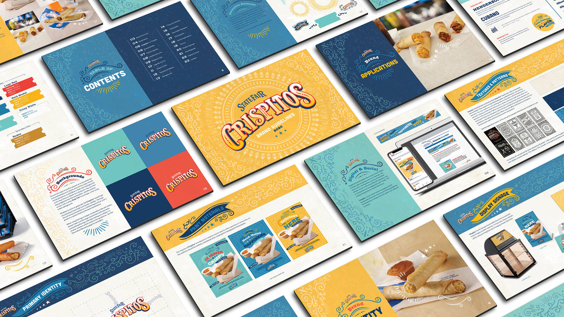
Crispitos® Brand Guidelines
We recently had the pleasure of working with Tyson® Foodservice to create brand guidelines for their delicious Crispitos® filled tortillas. After a lot (and we mean A LOT) of staring longingly at the tasty imagery, we dove in.
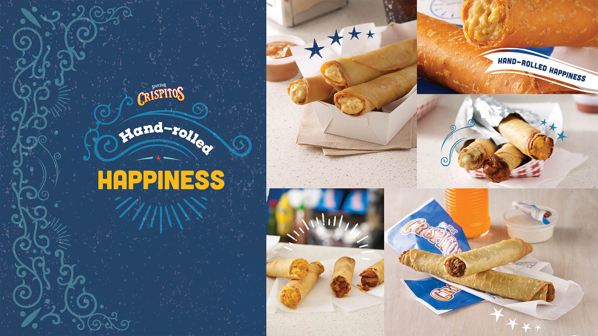
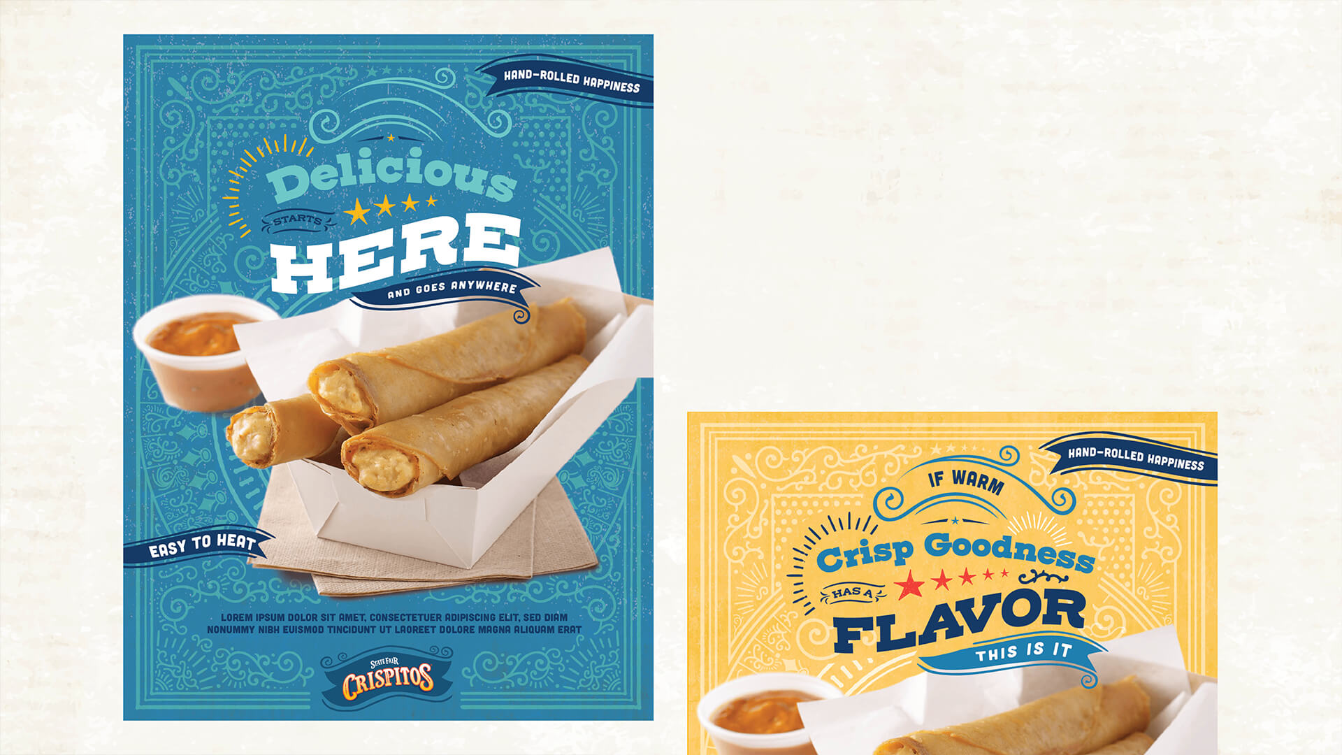
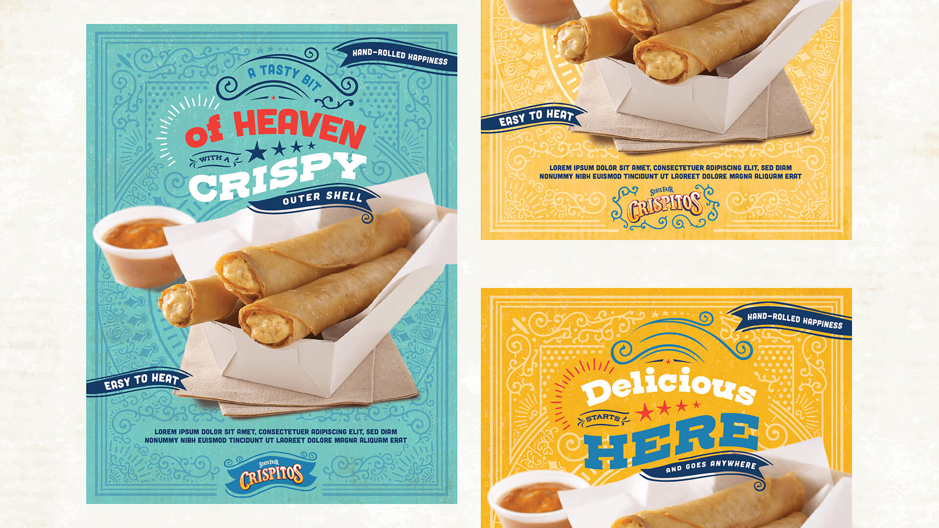
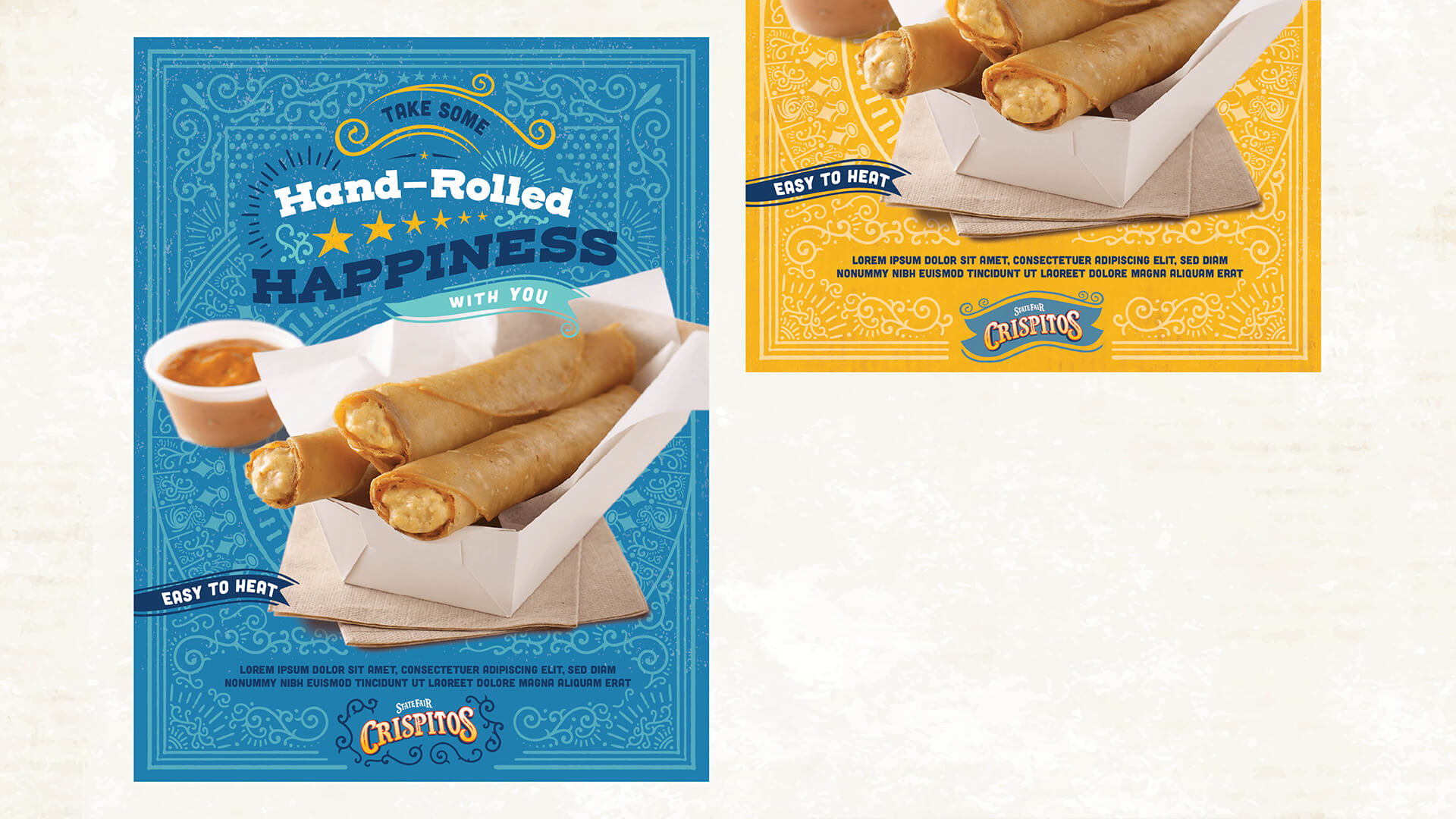
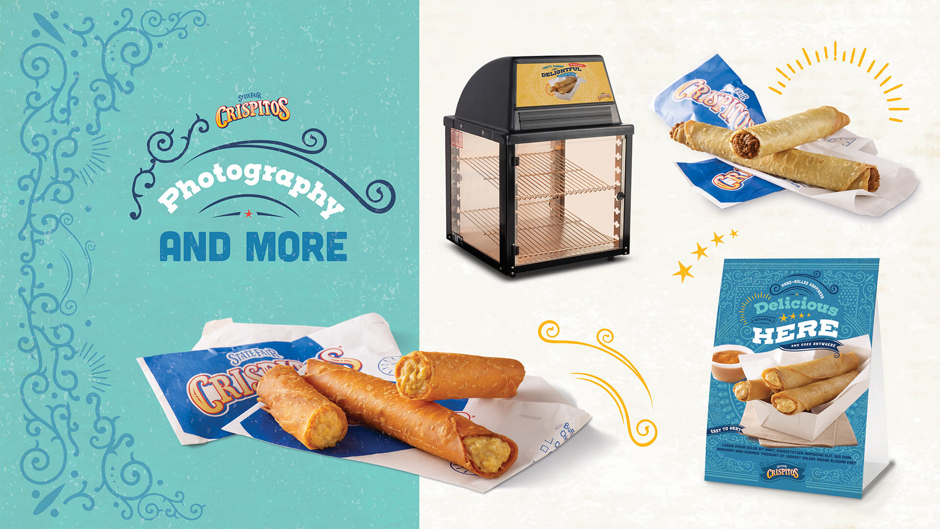
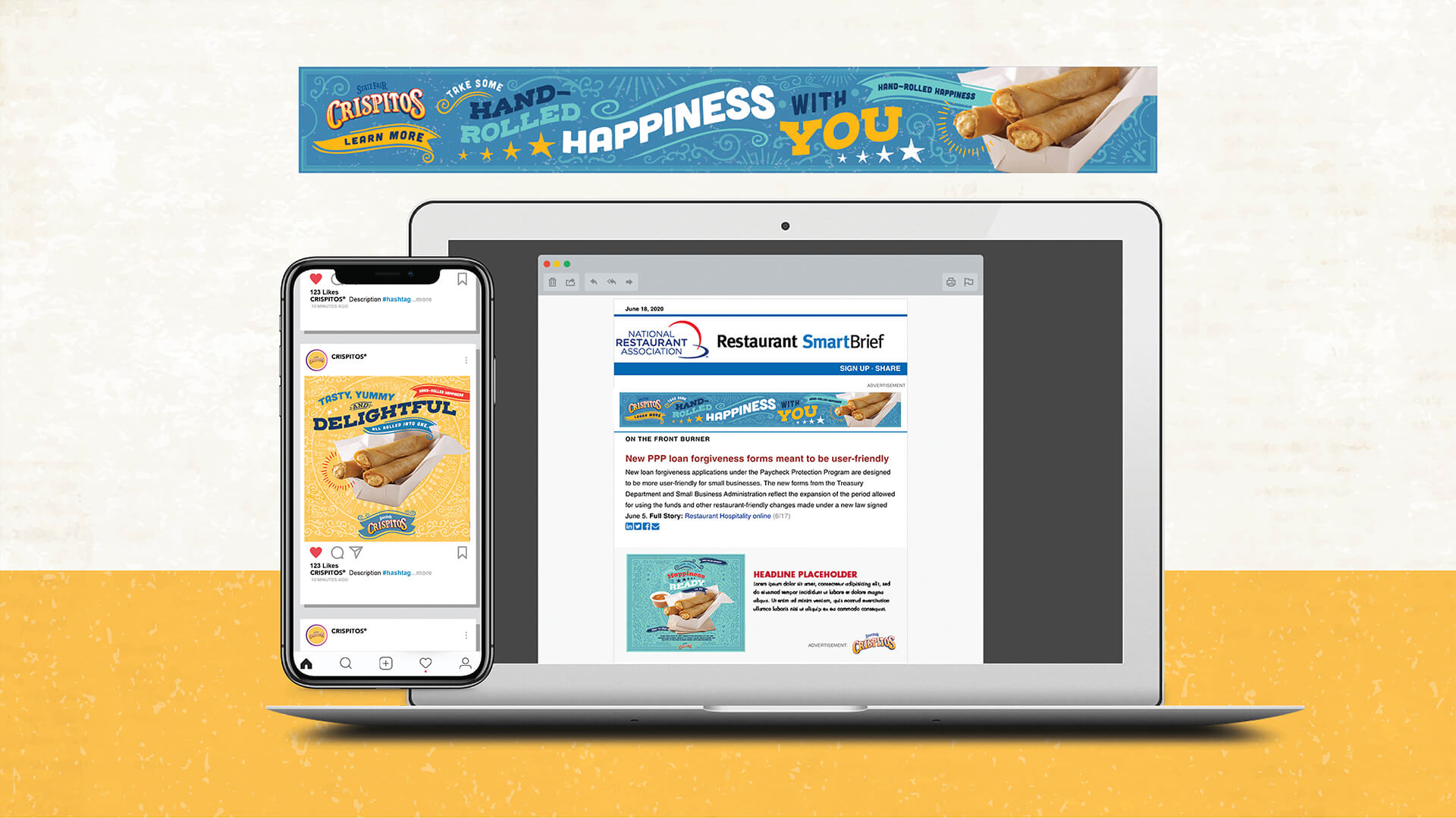
One of the things we love about Crispitos® products is the premium, hand-rolled look and the rich, indulgent flavors all wrapped in a delicious, crispy shell. We took this to heart and set out to create something that is just as visually appealing for operators as it is for those they serve. Because why should consumers get to have all the fun?
To start, we wanted to pay homage to the State Fair® brand roots, so we chose textures with a handmade, old-world feel like light distressed paper, scattered texture, and fun swirling elements. The brand colors utilize the original Crispitos® logo colors along with brighter ones to move the visuals into a more energetic space.
The fonts we use are a combination of an Americana-like slab-serif and a rounded condensed bold type, which can be used together or can stand alone in a creative headline treatment. We use an eye-catching accent font for conjunction and other applicable words and Gibson for body copy to keep layouts looking sturdy and cohesive.
The Crispitos® brand believes that no matter where consumers are or how fast their day is moving, they deserve a snack or meal that makes them feel like they’ve won the food lottery. We were delighted to be able to carry that belief forward into brand guidelines that convey that sense of fun, celebration, and a little bit of the unexpected.