Share on...
Orrington Farms Windmill Barn & Silo Scene

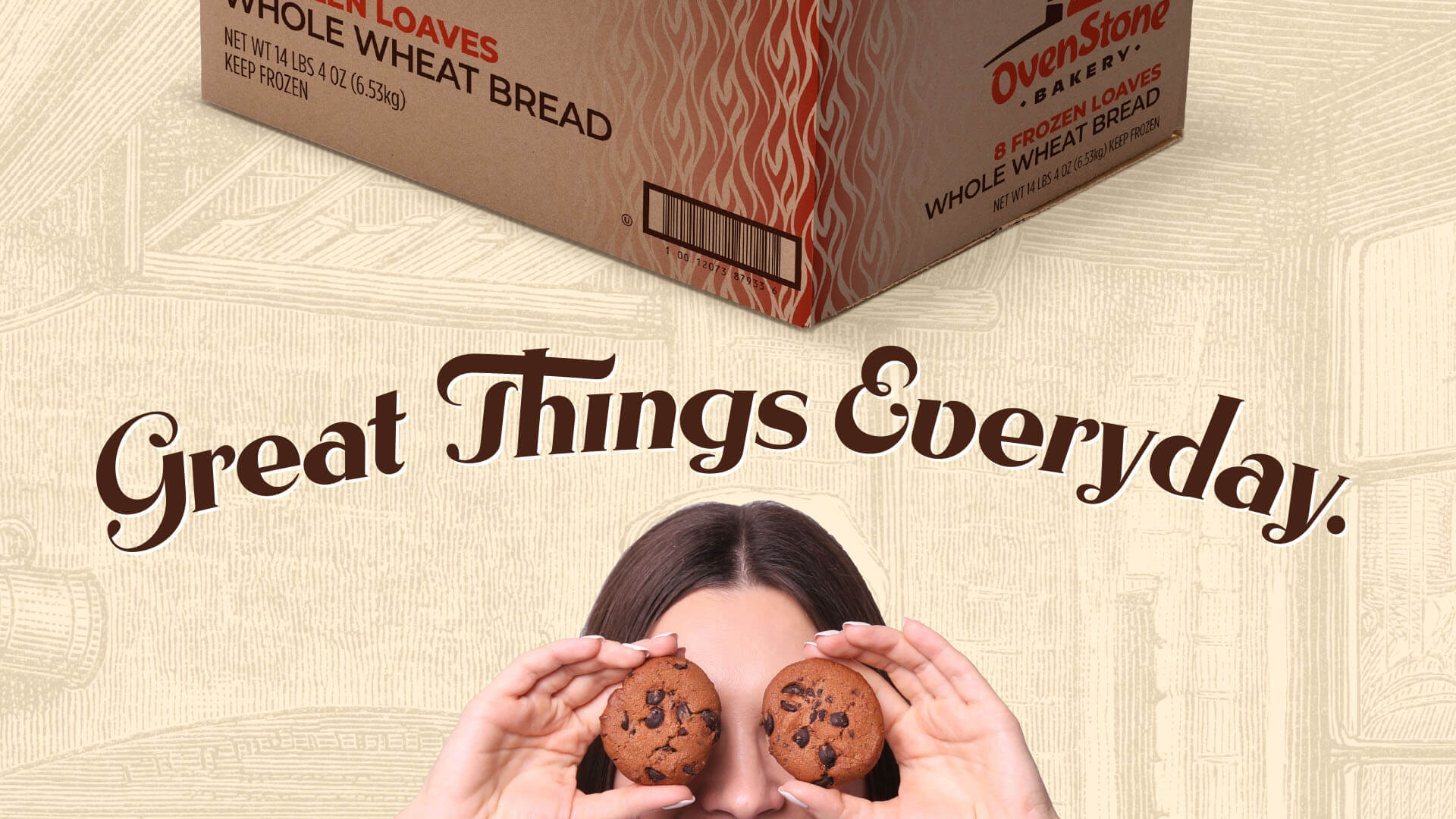
Orrington Farms Re-Brand

With low consumer awareness, small share and distribution in retail, and major brands playing in the same category, Orrington Farms needed a brand refresh and a campaign that would invite new customers to experience premium taste as pure as the farm.

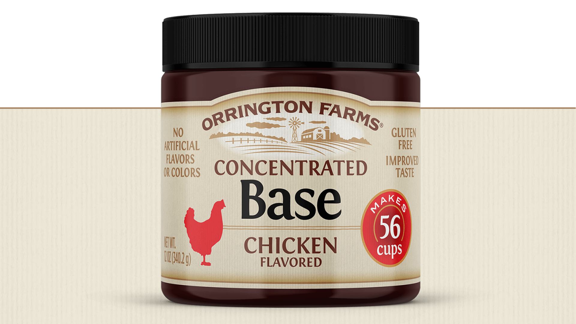
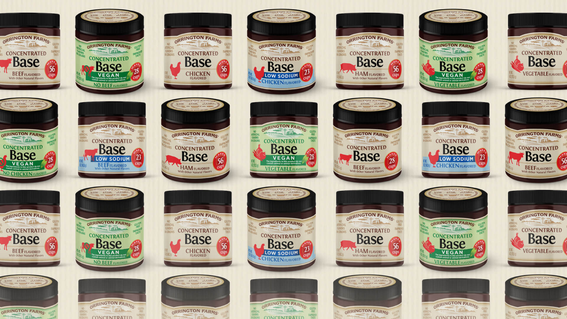
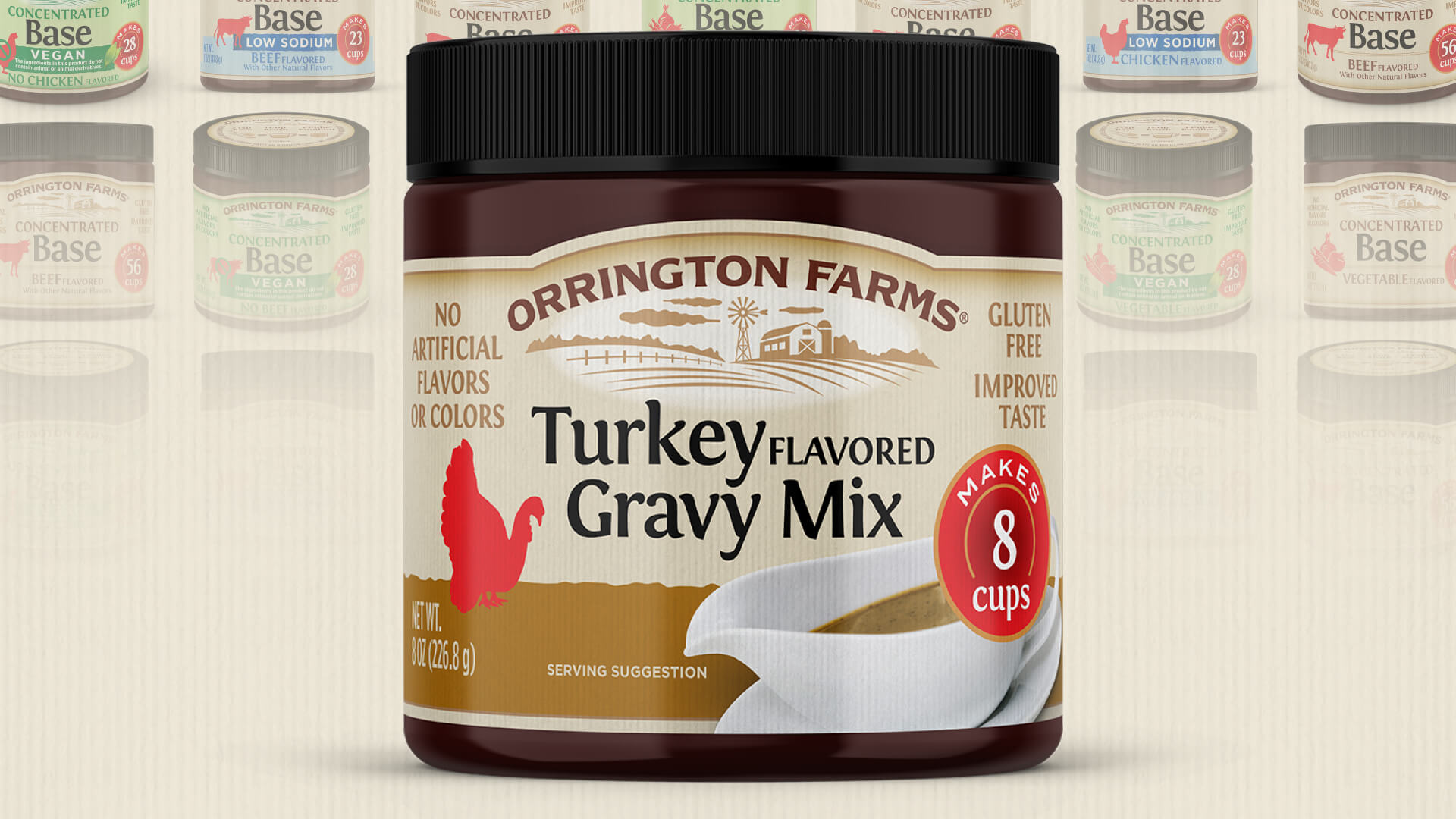
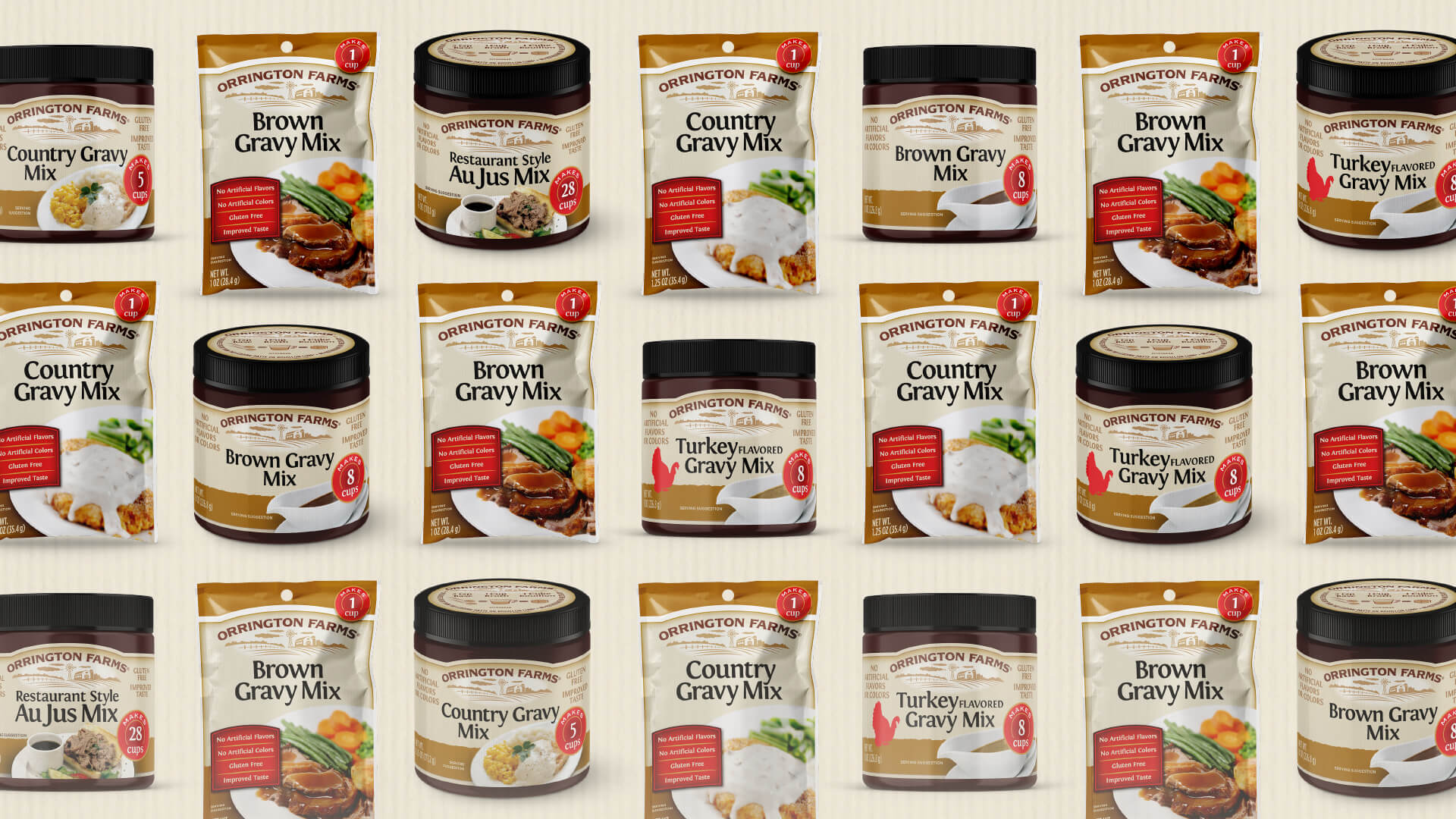
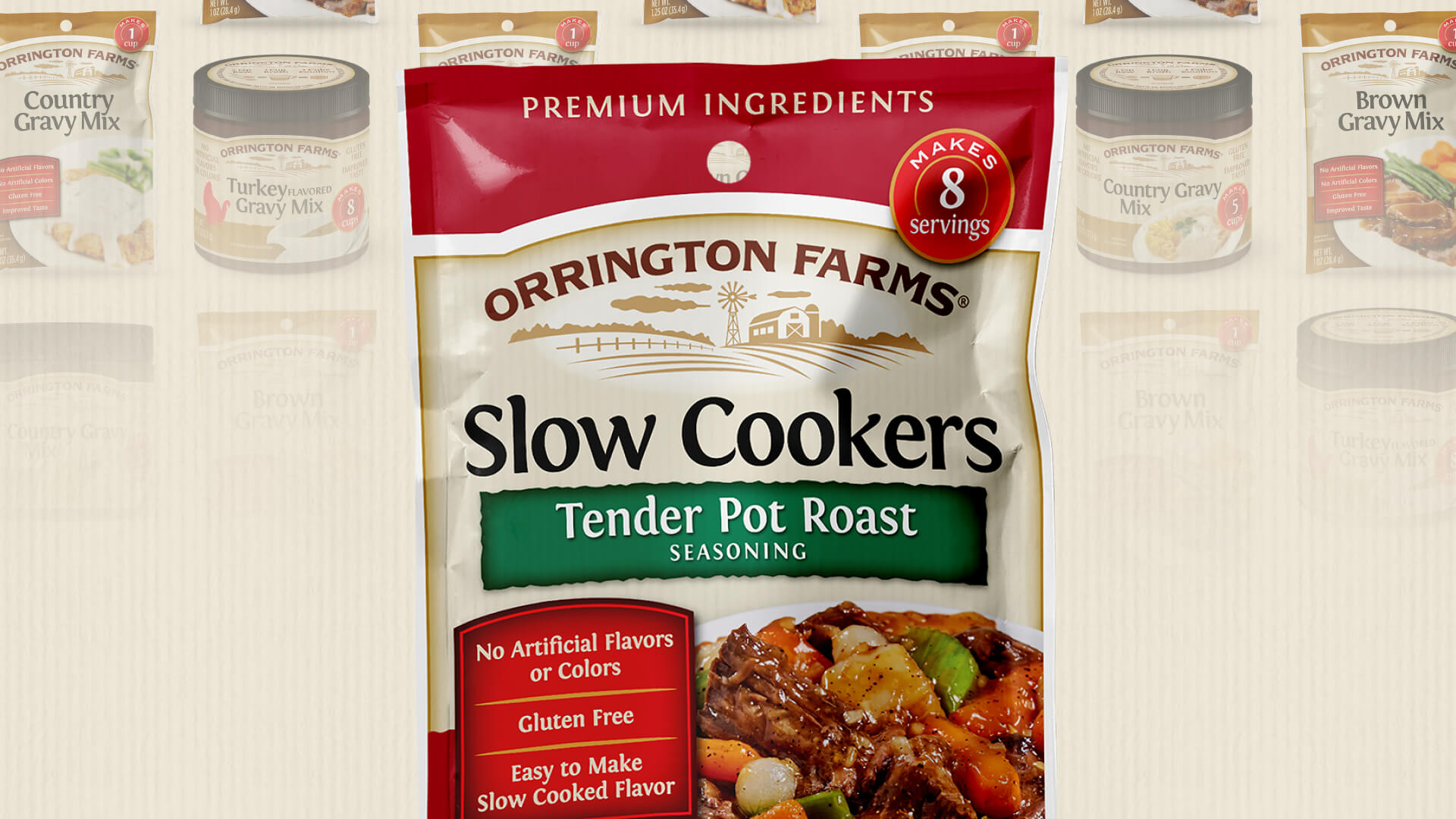
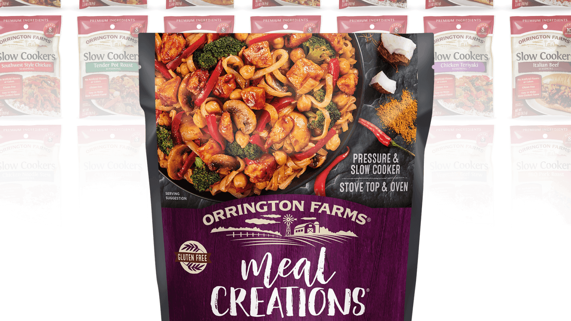
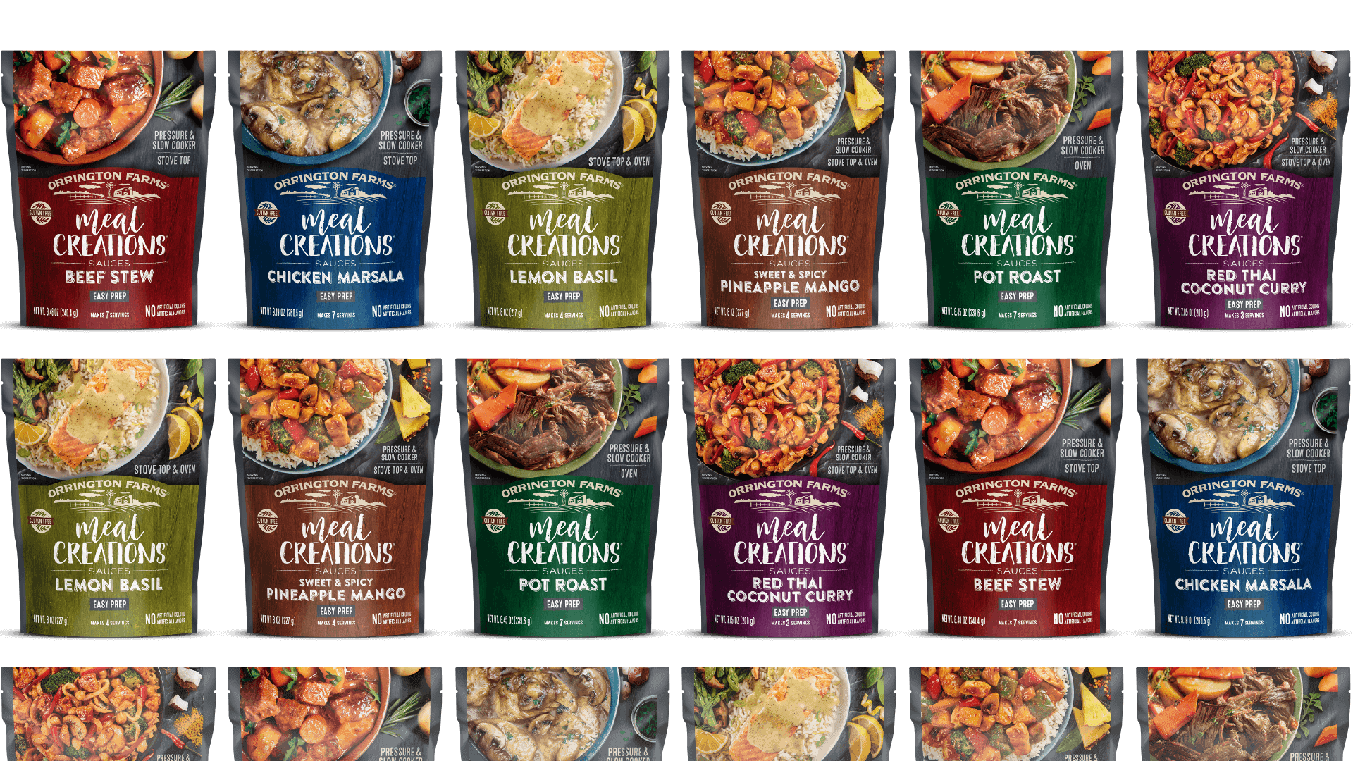
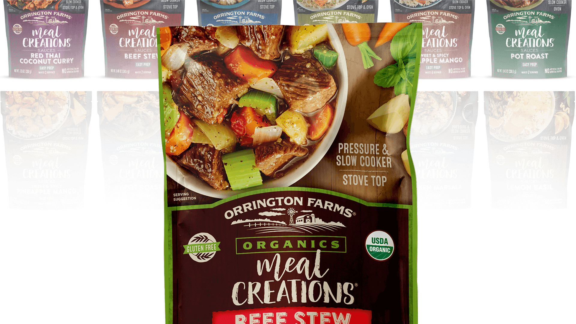
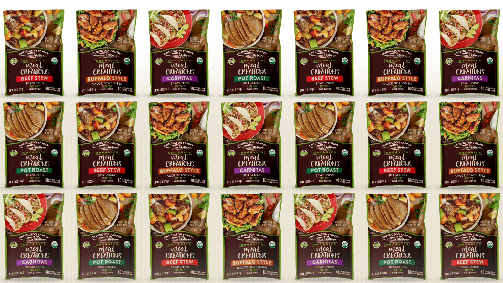
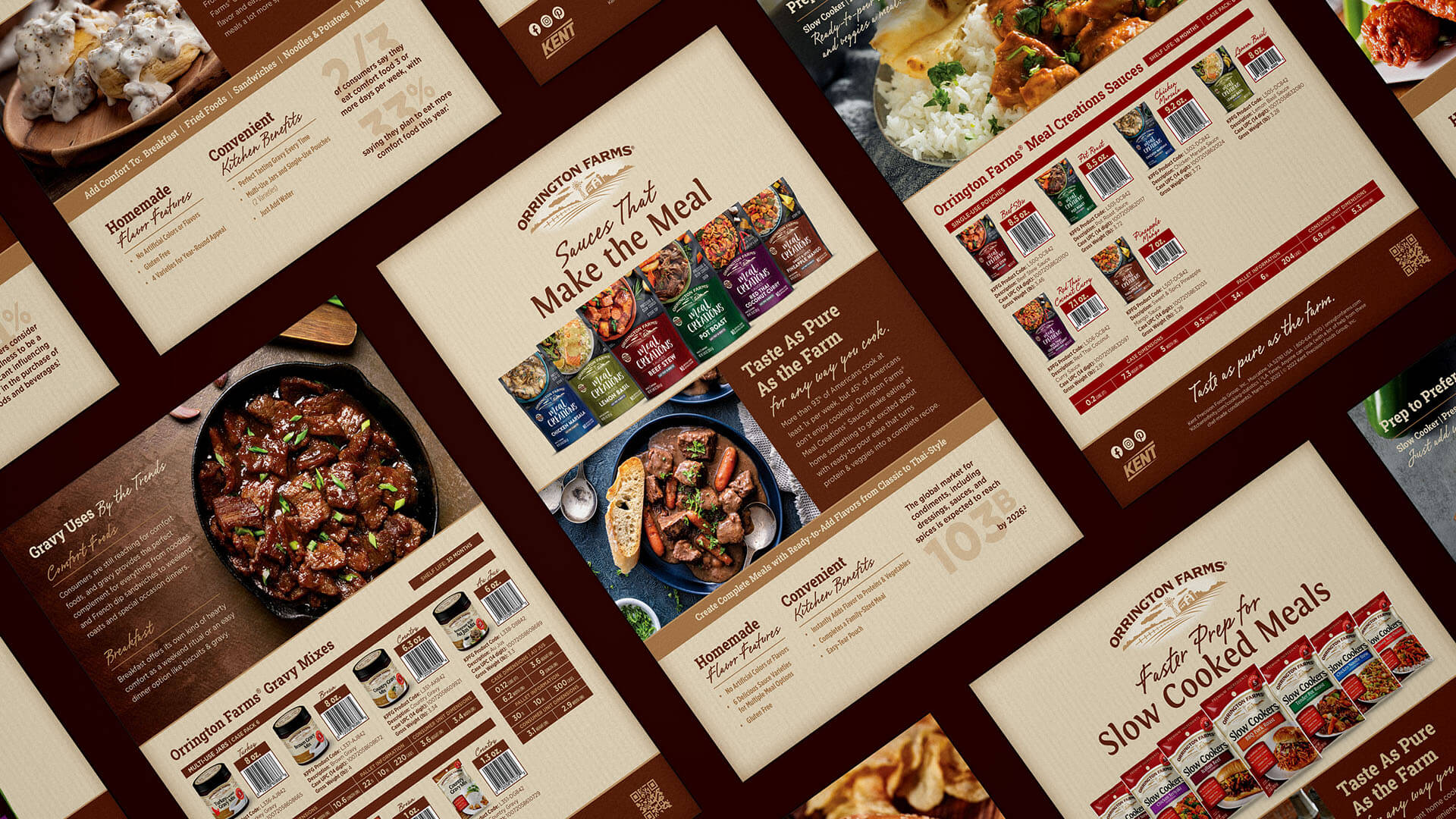
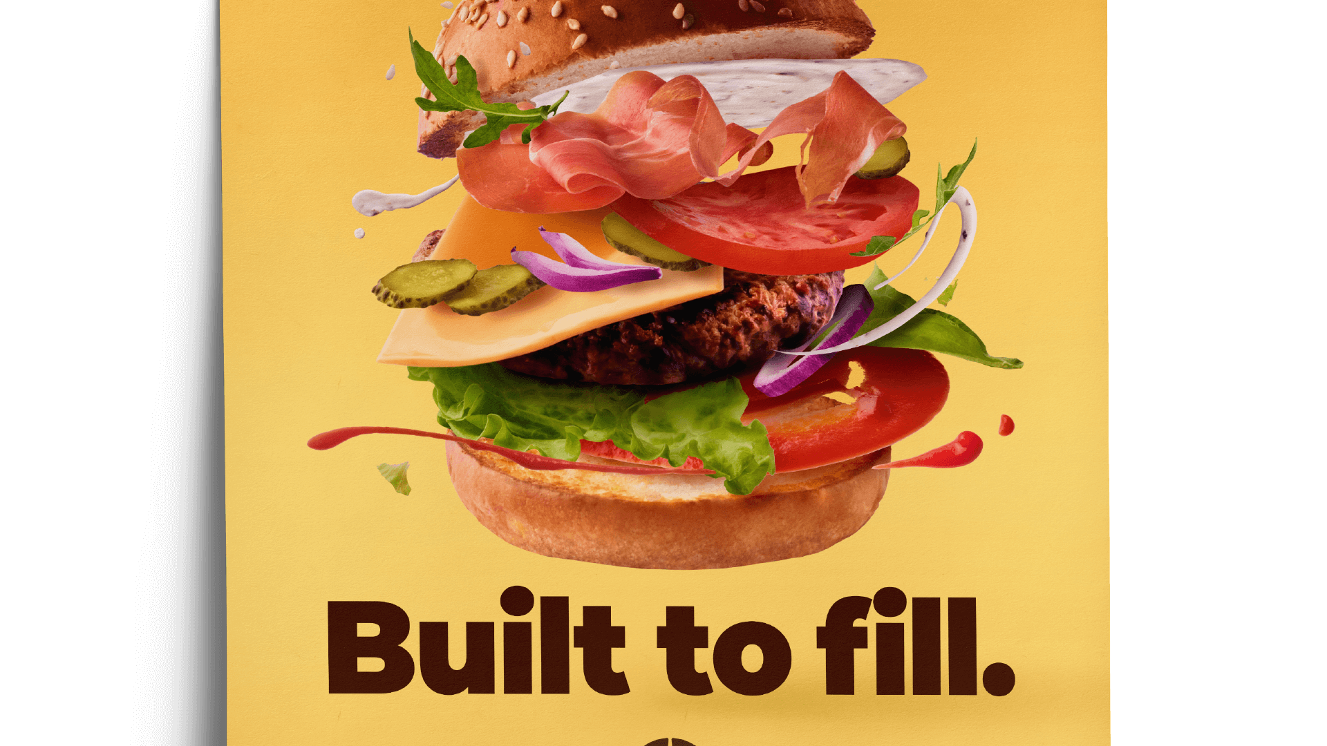
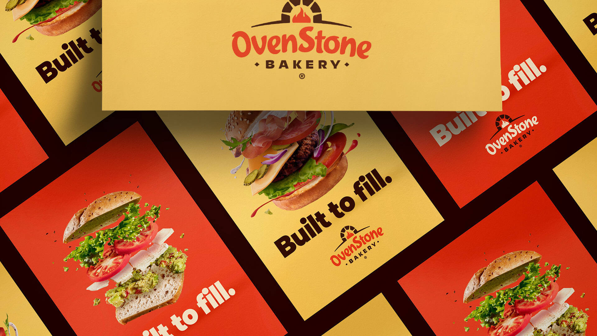
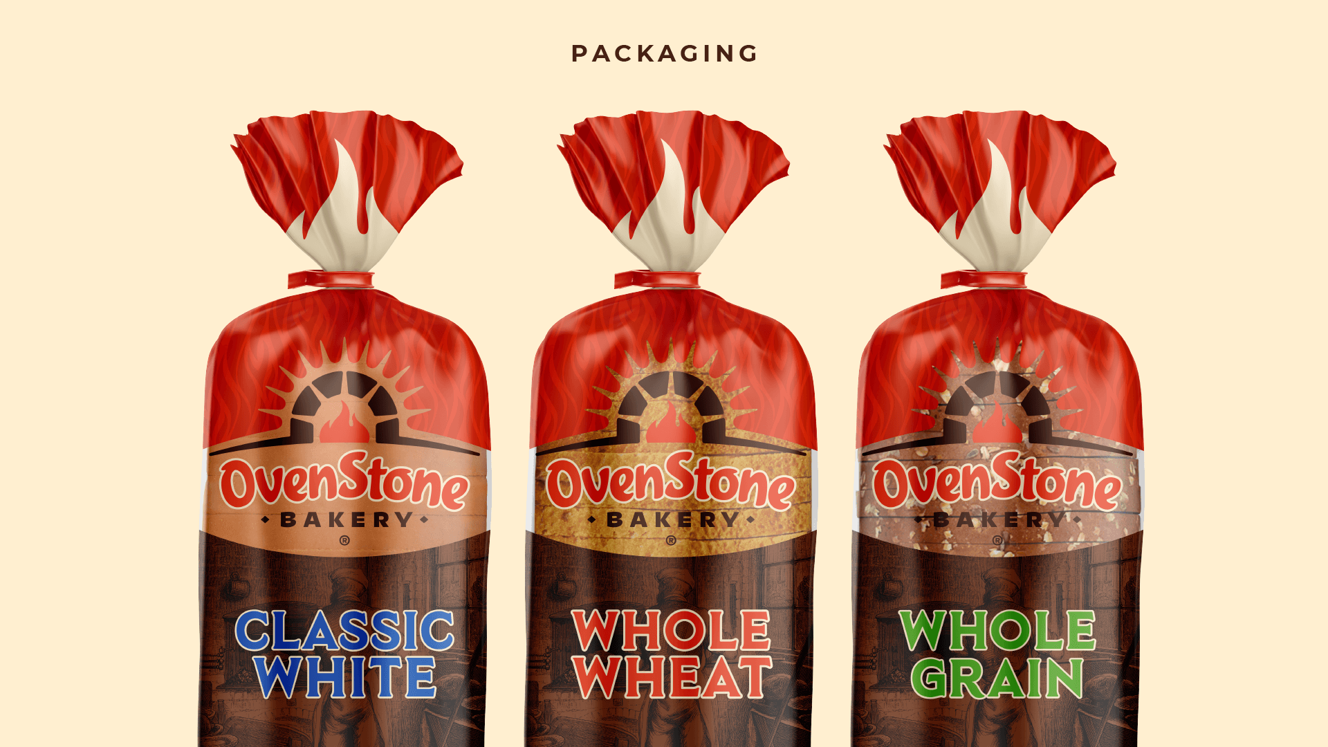
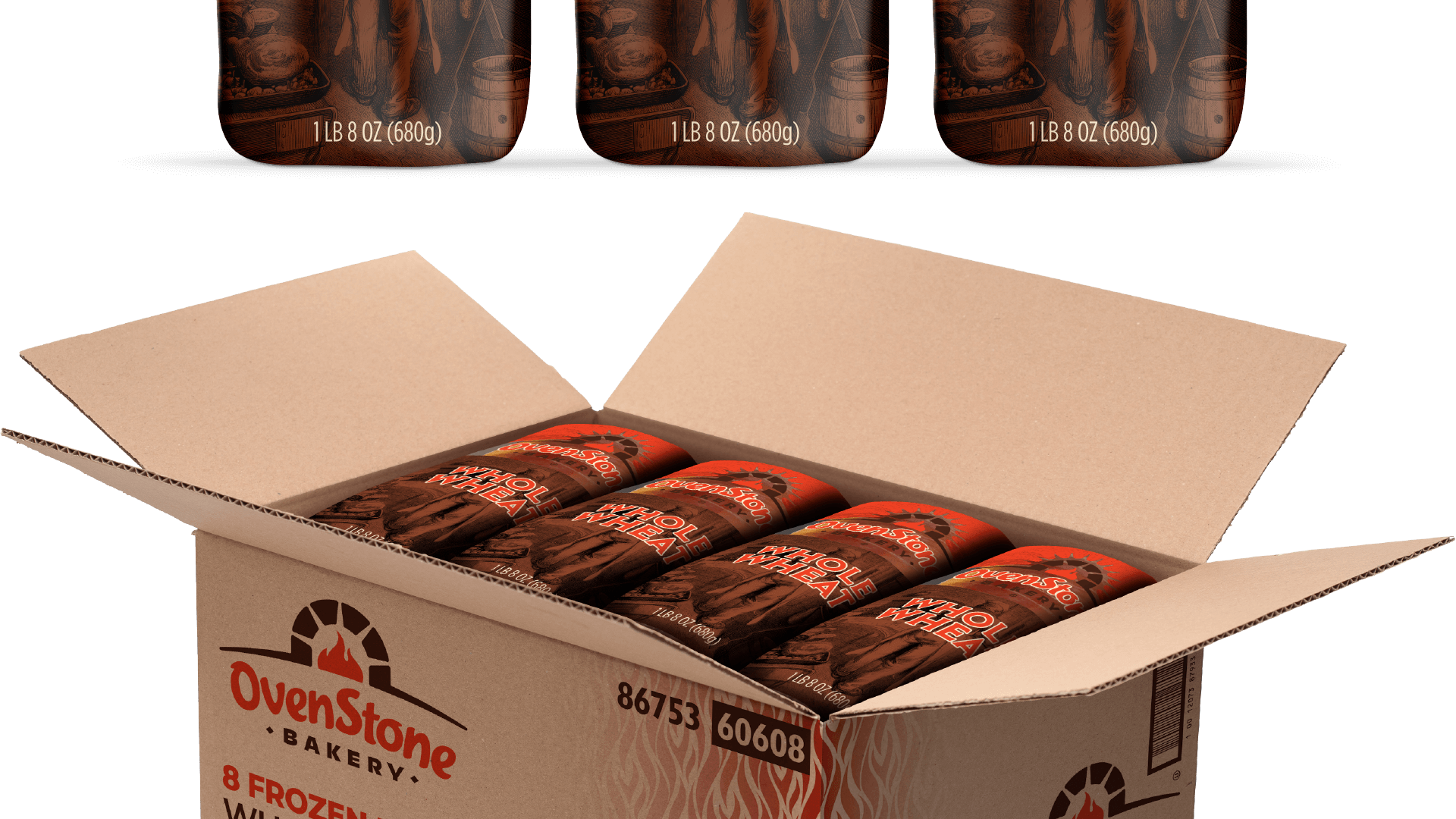
Starting with their line of concentrated bases, we wanted to showcase the power of the brand not only as the start of homestyle savory soups but also a means of transforming ordinary recipes into make-again meals everyone will ask for. Revitalizing product packaging, updating the brand website, and creating a digital media campaign worked together to play up the farm-style heritage and flavor-enhancing ease of Orrington Farms products.

Orrington Farms Brand Guidelines
Orrington Farms Original LogoOrrington Farms Updated Logo

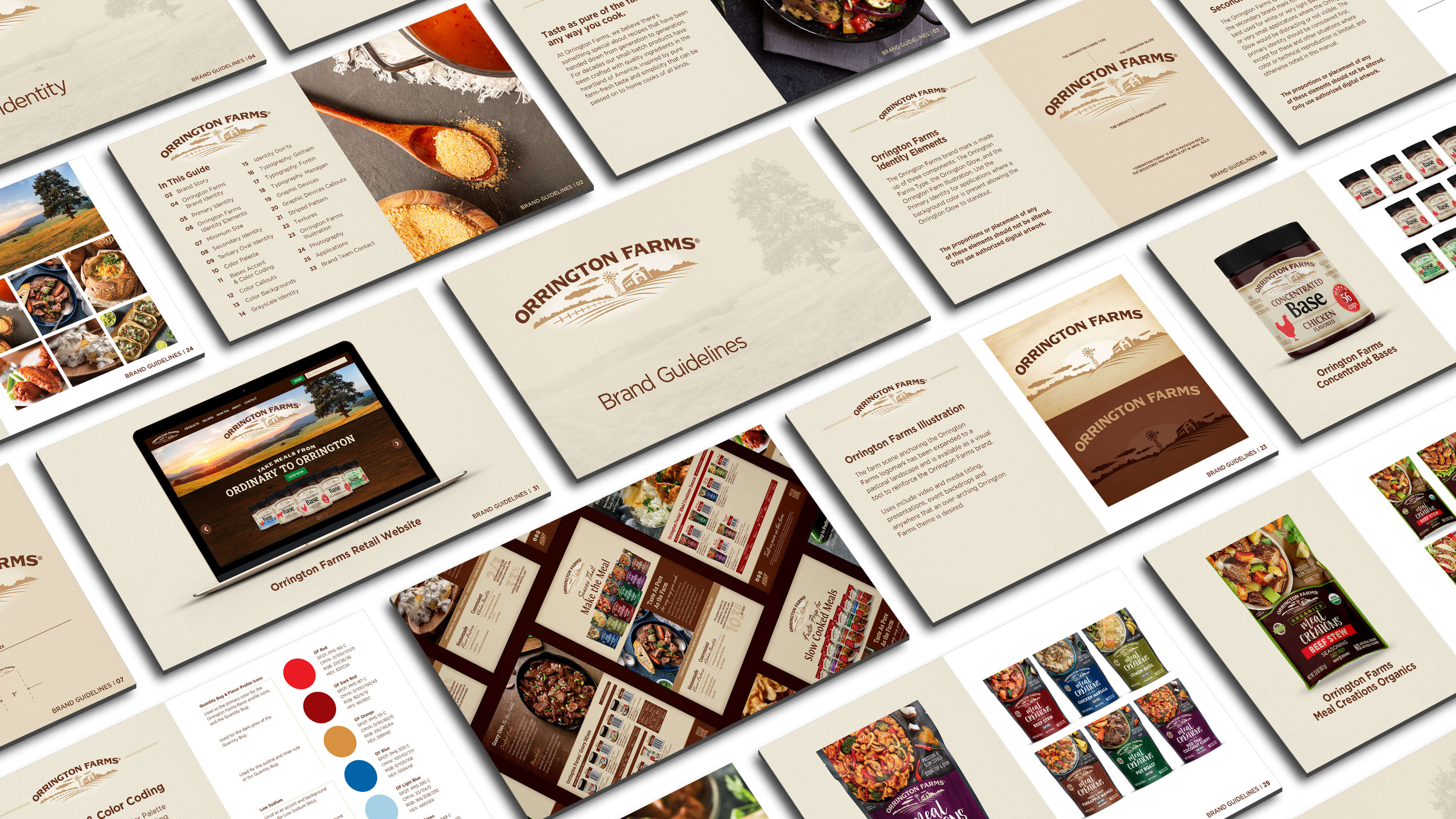
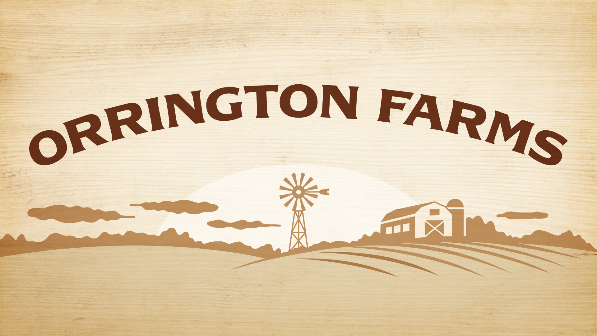
After focus grouping a number of new logo concepts with current customers, we discovered that the original Orrington Farms logo had significant consumer recognition and a high-level of brand trust. So, to maintain and build upon Orrington’s brand equity, the existing logo was updated. We started by refining the farm scene which included opening-up the windmill, barn and silo’s negative space, with both elements slightly shifted to sit properly against the scene’s horizon. The treeline was softened and simplified with the crop row’s strokes more unified in size and spacing. This, along with a beefier, more prominent type selection for the Orrington Farms moniker help the logo work harder on the shelf, more legible in smaller applications, with an overall cleaner presentation for a stronger brand presence.

Orrington Farms Concentrated Chicken Flavored Base JarOrrington Farms Concentrated Bases Jar Wall of ProductsOrrington Farms Turkey Flavored Gravy Mix JarOrrington Farms Gravy Mixes Product WallOrrington Farms Slow Cookers Tender Post Roast Seasoning PacketOrrington Farms Slow Cookers Tender Post Roast Seasoning Packet BottomOrrington Farms Slow Cookers Seasoning Packets Product WallOrrington Farms Meal Creations Red Thai Coconut Curry PouchOrrington Farms Meal Creations Red Thai Coconut Curry Pouch BottomOrrington Farms Meal Creations Products Pouches WallOrrington Farms Meal Creations Organics Beef Stew PacketOrrington Farms Meal Creations Organics Beef Stew Packet BottomOrrington Farms Meal Creations Organics Products Packets WallOrrington Farms Striped BackgroundOrrington Farms Sell Sheets OverheadOrrington Farms – So long! Sign Off Windmill Barn & Silo Scene
Share on...
The New Yellow Bonnet Girl Icon

Yellow Bonnet Brand Development

Founded in 1865, the Springfield Grocer Company, now SGC Foodservice, stocked everything from ammunition to barb wire to clothing to school supplies. The evolution from small farmsteads to the urbanization of once smaller rural communities gave rise to the Yellow Bonnet brand.

In the early 20th century SGC began to focus on supplying small business operators with nearly everything needed to stock their stores and storerooms. SGC leveraged the demand by creating entirely ownable retail brands with Yellow Bonnet the most successful and most memorable.


Yellow Bonnet Brand Guidelines

The Yellow Bonnet brand was everywhere, and everywhere it appeared, so did the Yellow Bonnet girl. Match boxes, containers of syrup, bottles of grape juice, jars of salad dressing, coffee tins, cocoa labels, and on about any staple grocery item imaginable. Regionally, the brand was as recognizable as any national brand is today.

The different versions of the Yellow Bonnet Girl

The hallmark of the Yellow Bonnet brand is the beloved girl synonymous with it. Re-imagined and redrafted, her new look is confident, optimistic and determined, a clear departure away from the original demurred Yellow Bonnet Girl.

Simplifying the new Yellow Bonnet Girl rendering down to its most basic elements, she is transformed into something more contemporary while still holding true to the heritage she represents.

Yellow Bonnet Girl Original and UpdatedYellow Bonnet Primary Logo Falling Hamburger BunsYellow Bonnet Wide Logo Falling Hamburger BunsYellow Bonnet Falling Hamburger Buns Authentic Baked Goods PositioningYellow Bonnet Falling Toast Branded Corrugate BoxYellow Bonnet Falling Toast Blue HoodieYellow Bonnet Falling Toast Branded Box TruckYellow Bonnet Falling Toast Yellow ApronYellow Bonnet Falling Toast & Hot Dog Montserrat PangramYellow Bonnet Falling Hot Dog Manofik PangramYellow Bonnet Falling Hot Dogs ThanksYellow Bonnet Falling Hot Dog

Share on...
The Pub® burger image on a table. Your next mouthwatering masterpiece is waiting to be made. Beef Rebrand.

An Eye-catching, Mouthwatering Beef Rebrand

There’s nothing we love more than really sinking our teeth into a rebranding. Especially when that rebranding happens to include a product we can literally sink our teeth into. Such was the case with our recent work with the Tyson Foodservice brand The Pub®. Because it’s so well known for providing operators with a delicious, premium product that they can build on, we dedicated ourselves to creating a logo and beef rebrand materials that would do that heritage justice.

Speaking of the logo, when we started work on revitalizing The Pub®, we wanted to modernize the logo while maintaining the sense of history and reliability that is so integral to the brand character. We reduced some of the older unnecessary elements and added a tagline to help the brand maintain its essence across all uses and materials. The updated photography captures the feel of a pub’s atmosphere and the brand colors were subtly worked into each setting as well.  We chose a new font pairing to give the brand a more contemporary feel that, much like a quality rug, really ties everything together. The expressive brush font was chosen to enhance the artistic “masterpiece” theme, and the sturdier san serif font helps ground everything.

In the end, we couldn’t be happier with how this mouthwatering beef rebrand turned out. We love the way all the different components came together with a fresh logo, eye-catching marketing materials, and some helpful brand guidelines to help place this wonderful brand and all of its products into a package that’s so vivid you can almost taste.

The Pub® Brand GuidelinesThe Pub® logo with white background, blue background, and yellow background examplesPoster with text that readys "We call it a masterpiece" and a burger imageThe bottom of a poster that reads "We can call it delicious"Digital ad examples. Displayed on the background as well as a laptop and cell phone.Food warmer and shelf dangler ad examples.Food warmer with display and shelf dangler. The top portion of a brochure.Thanks!

Share on...
Tenderbroil® Beef Patties Rebrand Overhead Hamburger Image

A Beef Rebrand You Can Sink Your Teeth Into

Tyson Foodservice has so many great brands that last the test of time. Of course, the longer they’re around, the more likely they’ll need some updating from time to time. Luckily, refreshing brands is one of our favorite things to do. Tyson’s Tenderbroil® brand is well known for its great taste and reliable performance, so to match that well-earned reputation, a contemporary top-to-bottom rebrand was necessary. That’s right, we’re talking about a full beef rebrand; refreshed logo, a new brand style guide, and some eye-catching collateral for good measure.

As far as the logo, our task was to modernize it while maintaining the overall look, feel, and color palette. By removing the solid background and updating the container, we were able to create a fresh feel while keeping it recognizable to all its loyal customers. With the style guide, we were able to establish consistent fonts, colors, textures, and photography as well as a tone of voice that will extend out to all future messaging. The result? An excitingly modern — yet familiar — beef rebrand with an established style unifying all marketing materials. And maybe a tasty sample burger here or there. For research of course.

Tenderbroil® Patties Style Guide PagesTenderbroil® Patties Primary Logo & Mushroom Onion HamburgerTenderbroil® Patties Typography Bank Gothic DistressedTenderbroil® Patties Satisfy. Repeat. Hamburger PosterTenderbroil® Patties Color Palette & TexturesTenderbroil® Patties Ball Cap & Shipper BoxTenderbroil® Patties Brochure & Coleslaw Topped HamburgerTenderbroil® Patties Thanks

Share on...
OvenStone Bakery

OvenStone Brand Development

Nothing satisfies like fresh-from-the-oven baked breads, buns, wraps, and every other bakery case staple or treat. OvenStone is UniPro’s everyday baked goods product line offering member foodservice distributors a full range of affordable bakery-fresh products.

Marlin developed the OvenStone brand by identifying key competitors, the brand name, logo, and numerous applications, all supporting the OvenStone’s promise of great things every day.

OvenStone Bakery Brand GuidelinesOvenStone Bakery Primary LogoGreat Things Everyday – We believe that ovens do more than bake. Of course, the hearty, delicious, aromatic baked goods are vital, but so is the feeling of wholesome, quality goodness that comes with a lovingly baked product. And we want that feeling to be present in every meal throughout consumers’ busy lives. That’s why OvenStone Bakery works so hard to bake everyday goodness into every bread, dessert, and snack we sell. From our hearth to your kitchen, OvenStone is the keystone of quality and consistency in your back-of-house and on your patrons’ tables.OvenStone Bakery Built to Fill PosterOvenStone Bakery Built to Fill Poster GroupOvenStone Bakery Bagged Bread GroupOvenStone Bakery Corrugate Boxed BreadGreat Things EverydayOvenStone ApronOvenStone Bakery Chocolate Chip Cookies PackagingS&S Hilborn Type Specimen Pangram: Inquiring minds just knead to dough where OvenStone homestyle pre-boxed frozen ciabatta breads can be bought.Montserrat Type Specimen Pangram: OvenStone Bakery bakes doughy pretzels, coquettish crumbly cookies, and extra jumbo paper-wrapped muffins.Rhythm One Solid Type Specimen Pangram: Excellent OvenStone, the crust, a crumb! A little trust, a demijohn can keep the soul alive. Not portly, mind! But breathing warm, conscious as zealous Napoleona night before the Queen’s crown!OvenStone Bakery Thanks Mom!

Share on...
State Fair Crispitos Brand Guidelines

Crispitos® Brand Guidelines

We recently had the pleasure of working with Tyson® Foodservice to create brand guidelines for their delicious Crispitos® filled tortillas. After a lot (and we mean A LOT) of staring longingly at the tasty imagery, we dove in.

One of the things we love about Crispitos® products is the premium, hand-rolled look and the rich, indulgent flavors all wrapped in a delicious, crispy shell. We took this to heart and set out to create something that is just as visually appealing for operators as it is for those they serve. Because why should consumers get to have all the fun?

To start, we wanted to pay homage to the State Fair® brand roots, so we chose textures with a handmade, old-world feel like light distressed paper, scattered texture, and fun swirling elements. The brand colors utilize the original Crispitos® logo colors along with brighter ones to move the visuals into a more energetic space.

The fonts we use are a combination of an Americana-like slab-serif and a rounded condensed bold type, which can be used together or can stand alone in a creative headline treatment. We use an eye-catching accent font for conjunction and other applicable words and Gibson for body copy to keep layouts looking sturdy and cohesive.

The Crispitos® brand believes that no matter where consumers are or how fast their day is moving, they deserve a snack or meal that makes them feel like they’ve won the food lottery. We were delighted to be able to carry that belief forward into brand guidelines that convey that sense of fun, celebration, and a little bit of the unexpected.

State Fair Crispitos Brand GuidelinesState Fair Crispitos Hand Rolled HappinessState Fair Crispitos Delicious Starts Here & Crisp Goodness Has A FlavorState Fair Crispitos A Tasty Bit of Heaven With A Crispy Outer Shell & Delicious Starts HereState Fair Crispitos Hand Rolled Happiness With YouState Fair Crispitos Photography & Warmer POS & Delicious Here Table TentState Fair Crispitos Tasty, Yummy Delightful Digital Ads

Share on...
Excellence Everyday

Rangeline Brand Development

For voracious appetites nothing satisfies like beef and nothing fills out a menu like all-beef patties and grinds. Rangeline rounds out UniPro’s center-of-the-plate program by adding the opportunity for member foodservice distributors to leave nothing on the table when fulfilling demanding operator’s protein needs.

Marlin developed the Rangeline brand from identifying key competitors, the brand name, logo, and numerous applications, all delivering the promise of excellence everyday.

Rangeline Cattle Company Brand GuidelinesRangeline Primary LogoMeats and Provisions for Excellence Every Day – You could say we know a thing or two about meats. Beef, pork, even some poultry—we are experts at raising and distributing quality products around the country. We know how to help you get the job done, and get it done right. Our line of meats and provisions delivers carefully raised animal protein for a variety of everyday menu applications. From the heart of the pastureland to the heart of your kitchen, we’re committed to bringing you excellent options with flavor, quality and consistency you can trust.Rangeline You Know What To Do With It PosterRangeline Red Polo ShirtRangeline Box, Packing Tape & Utility KnifeRangeline Magazine Ad – When we say our stuff always works, do we mean taste, budget, or variety? Yep.Rangeline Sales Sheet Cover – If it doesn’t taste good, honestly, that’s on you.Rangeline Montserrat Type Specimen Pangram: Y’all holler for another flavor-packed, juicy, sizzling, eximious Rangelıne two-pound BBQ’d burger.Rangeline Coluna Type Specimen Pangram: Knowing grinding heavy beef patties is a snooze job, operators always request Rangeline excellent meats.Rangeline Behemoth Type Specimen Pangram: Quickly fixin’ to make dough, Rangeline’s operators enjoy specialized views on big beefy patties.Rangeline Hamburger Patties Styro PackRangeline Thanks Signoff

Share on...
Landshire® Brand Guidelines Case Study

Landshire® Brand Guidelines

The good folks at Landshire recently asked if we would create brand guidelines to help flesh out the look and feel of the brand that would work in combination with the new logo and packaging designs they had previously developed. Spoiler alert: We said yes.

The developed designs worked with cloth texture, a colorful palette and a clean design. We wanted to complement that, so we took the look and feel and brought it down to a simplified 3-color scheme with some subtle, yet comforting, textures.

For the photography direction we wanted to focus on the on-the-go lifestyle that grab-and-go sandwiches allow you to have in more realistic, non-staged settings. To better capture this direction, we decided to showcase people enjoying the food and how it could complement their lifestyle. Going to the lake? Grab a few sandwiches. Late for work? Sandwich it up. Can’t figure out your kid’s math homework? Well, okay, a sandwich wouldn’t help much there, but it would still be really tasty. This direction helps highlight the benefits of the product instead of trying to make a simple sandwich something that it’s not. It’s delicious, easy, and saves you time. It’s not artisanal cuisine with over-the-top, fancy ingredients.

The fonts we used are a combination of the clean slab-serif packaging display font with a complementary, slightly messy script. The contrast of the two gives it an impactful, personalized feel and further emphasizes the sandwich itself and the on-the-go lifestyle.

The Landshire® brand is fun, down-to-earth and provides on-the-go solutions that anyone can appreciate. We couldn’t be happier to be able to bring that tone to these brand guidelines.

Landshire® Brand Guidelines PagesExcitement wrapped up and ready to go. No matter what the day brings, Landshire® Sandwiches are ready to deliver satisfying goodness on-the-go.Landshire® Brand Textures & ColorsLandshire® Operator Messaging Stats & SamplesLandshire® Consumer Messaging Table Tent & Hot Case POSLandshire® Social Media & Banner Ads

Share on...
Inspirations Artisan Bakery

Unbelievably Indulgent

Desserts are meant to be fun, unique and, above all, unbelievably indulgent. They provide the finish to our meals for a reason — that last delicious bite is the part we often remember the most. This strong emotional connection is what inspried Marlin’s brand development of UniPro’s Inspirations Artisan Bakery brand, bringing it to the forefront of our customers’ minds with a decadently delightful and unforgettable desserts product line.

Inspirations Artisan Bakery Brand Guidelines Our artisan approach to inspired baking is captured through our expressive hand lettered Inspirations calligraphy. The art of the Inspirations inscription imbues our desserts product line with the guarantee of craft and quality. The Inspired Swirl icon has been roughened to pair well with the script and made small, like the cherry garnish as the last fabulous flourish atop all our inspired confections.Inspirations Artisan Bakery Ball CapInspirations Artisan Bakery T-ShirtInspirations Artisan Bakery Muffin CupsInspirations Artisan Bakery Dessert LabelsInspirations Artisan Bakery Strawberries IllustrationInspirations Artisan Bakery Strawberry CheesecakeInspirations Artisan Bakery Lemons IllustrationInspirations Artisan Bakery Lemon Meringue PieInspirations Artisan Bakery Chocolate & Hazelnuts IllustrationInspirations Artisan Bakery Chocolate Chips & Hazelnut CookiesInspirations Artisan Bakery InSpinspirations Pinwheel & CupcakeInspirations Artisan Bakery Inspired by Fun Magazine AdInspirations Artisan Bakery InSwirlspirations Hair of Budha Detail & Pinwheel CookieInspirations Artisan Bakery Inspired by Details Magazine AdInspirations Artisan Bakery InBloomspirations Cherry Blossom & CupcakeInspirations Artisan Bakery Inspired by Nature Magazine AdInspirations Artisan Bakery Apron – Merci

Share on...
Clear Purpose

Copper Creek Brand Development

Savvy operators know that meals are built around protein, so naturally, the quality of what’s featured center-of-the-plate, matters. UniPro’s Copper Creek Cattle Company Upper 2/3rds Angus Beef program makes premium beef more attainable for more operators. And that value is passed all the way to front-of-house giving UniPro customers an edge over other foodservice distributor offerings.

Marlin developed the Copper Creek brand by identifying key competitors, the brand name and identity, brand introduction video, and numerous applications, all reflecting the promise of unwavering integrity and clear purpose.

Copper Creek Cattle Company Primary LogoCopper Creek Cattle Company Band GuidelinesPremium Black Angus – From the passionate pursuit of sustainable cattle ranching, to careful, expert handling at the butcher block, our Prime and Upper 2/3rds Choice Black Angus Beef is raised, sourced and crafted with unwavering integrity. We offer a full line of hand-selected cuts to meet all specialty and high-end applications. Set your menu apart with beautiful marbling and tender, juicy flavor from a company that prides itself in being the authority on Premium Black Angus beef.Copper Creek Cattle Company 100% Premium Angus Beef Integrity PosterCopper Creek Cattle Company Black Polo ShirtCopper Creek Cattle Company Box, Packing Tape & Utility KnifeCopper Creek Cattle Company Magazine Ad Spread – Around here even when it’s not about the beef, it’s about the beef.Copper Creek Cattle Company Sales Sheet Cover – Perfection isn’t possible. Clear purpose is.Copper Creek Montserrat Type Specimen Pangram: Awesome sizzling Copper Creek ribeyes locked-in juices quiet vexing pangs of hunger.Copper Creek Knockout Type Specimen Pangram: Copper Creek’s Hand-Selected Prizewinning Premium Angus Beef is Judged Equally by Flavor, Texture and FreshnessCopper Creek Knockout Type Specimen Pangram: Methinx twelve boot-quaking juicy seared Copper Creek Angus beef steaks sound crazy great.Copper Creek Cattle Company Angus Beef Steak Styro PackCopper Creek Cattle Company Butcher Signoff

Share on...
UniPro’s Companions Disposables Product Line Logo

A Helping Hand Everyday

UniPro, America’s largest foodservice buying group helps smaller regional foodservice distributors compete head-to-head with the dominant national players. Aside from volume purchasing, a portfolio of private labels competing with consumer brands help keep prices down.

The Companions non-food product line offers the basics including paper towels, rubber gloves, aluminum foil, toilet paper, and napkins. It’s among the many UniPro private label categories and was the first of the many new or re-brand assignments tasked to the Marlin brand team to tackle.

Companions Brand GuidelinesCompanions Logo Before and After

Lending a helping hand by containing, carrying, or cleaning — that’s what the Companions product line does. The Campanions icon is built by mirrored hands, symbolizing the everyday can-do helping hands attitude of UniPro’s non-food product line.

Companions Brand PositioningCompanions Logos GridCompanions Type Specimen Pangram: Knowledgeable foodservice operators choose UniPro’s Companions expert line of quality disposables and sanitary supplies to make any job a whiz.Companions Toilet Paper Tissue Rolls Mockup

Tiered for value, Campanions Premier, Merit, and Essentials product lines’ offers operators a range of quality and price choices to best serve their customers.

Companions Quality Tiering SchemeCompanions Paper Towels MockupCompanions Paper Towel Palleted CasesMan Holding Companions Vinyl Gloves CaseCompanions Vinyl Gloves BoxCompanions Vinyl Gloves Box DielineCompanions NapkinsCompanions Napkins and Aluminum FoilCompanions What you need, when you need it. Hand Trucked Paper Towel Cases

Share on...
Yakima Chief Hops Blends Icons Hero

Blended for a Purpose

Alongside single strain hop varieties are hop blends offering a new way of adding never-before-tasted unique hop flavors for brewers. Much like the tradition of blending coffee beans from a variety of sources to create more balanced flavor profiles, hop blends promise these same benefits.

In addition to Yakima Chief Hops’ Independence, Pacific Crest, and Zythos blends, YCH offers four cause-based efforts that blend great hop flavors with four unique missions to do good. Choosing Pink Boots, Veterans, PAWS, or Falconer’s Flight blends are all great ways our favorite breweries can give a little bit back by simply doing what they do best.

Marlin created seven uniquely YCH branded icons that work just as hard as the beers they inspire.

Yakima Chief Hops Independence Blend IconYakima Chief Hops Pacific Crest Blend IconYakima Chief Hops Zythos Blend IconYakima Chief Hops Blends I Gave Back Social MessagingYakima Chief Hops Pink Boots Blend IconYakima Chief Hops Veterans Blend IconYakima Chief Hops PAWS Blend IconYakima Chief Hops Falconer’s Flight Blend IconYakima Chief Hops Veterans Blend Landing PageYakima Chief Hops Pink Boots Brewers Pink Rubber BootsYakima Chief Hops Veterans Blend Tattooed Beer PullYakima Chief Hops PAWS Blend Scarfed Pup

#
Share on...
Fellers Hero

A Redesign 75 Years in the Making

After 75 years as a foodservice equipment provider, Fellers needed a rebrand that reflected all that’s changed in three-quarters of a century. Starting life towards the end of World War II, Fellers Fixtures saw an opportunity in reselling restaurant fixtures and equipment. Over the decades, the reseller’s trusted reputation for new and used equipment gave way to full-service back-of-house kitchen planning, design, and outfitting.

With the acquisition by SGC Foodservice, a midwestern regional foodservice distributor, the rebranded Fellers’ is poised to play a vital role with foodservice operators looking for outstanding equipment and innovative ideas on how to make the most of their kitchens.

Fellers Style GuideFellers Primary Logo

The Fellers icon is more than an ‘F’ — the shapes form a small vignette of a building, with the rhombus as a roof and the circle and rectangle as the structure. This contemporary and enduring solution is made friendly by “Fellers” typeset in title case and featuring happy ‘Es’ and hooked ‘Ls’ adding a little more warmth to the Fellers brand.

Fellers Tagline: Bringing foodservice equipment and design togetherFellers Service VanFellers ToolboxFellers Secondary LogoFellers Ball CapFellers Service Manual & Documentation Ziploc BagMontserrat Type Specimen: Every well-equipped back-of-house kitchen design expertly jump starts work zone efficiency.Montserrat Type Specimen: From freezers to fryers, our abiding Fellers’ fellows jovially equip kitchen fixtures.Fellers StationeryFellers Billboard: Bringing foodservice equipment and design togetherFellers T-shirt : Bringing foodservice equipment and design together.Fellers Zipper Jacket & Thanks! Signoff with Pencil & Clipboard

Share on...
Runaway Grub Food Truck Service Side

Keep on Food Truckin’

In a fight, who wins between bread and waffles? Waffles every time. The minds behind Runaway Grub knew this and developed an entire food truck menu around it. Featuring breakfast and chicken sammies all wrapped in waffles, along with some unusual crunchy, always-tasty toppings, Runaway Grub tempts and satiates hungry filler-uppers exclusively at Sunoco-branded and -partner gas stations. Marlin was enlisted to develop the branding, food truck graphics, and messaging for this concept built around unexpected, possibly impossible combinations. 

Runaway Grub Brand GuidebookThe Runaway Grub Logo

Inspired by the one-of-kind flavor twists, the Runaway Grub logo takes an MC Escher-like turn. The surrounding typography is erratic and grungy, and the logo weaves into a winding backdrop creating an eye-catching visual that speaks to the creative culinary happening at this unexpected, yet downright delicious rolling restaurant.

Runaway: Anything that’s run away is a thing difficult to predict and nearly impossible to contain. With the twist of unexpected ingredients or combinations…The Runaway Grub Food Truck Three Quarter ViewThe Runaway Grub Food Truck Front ViewRunaway Grub Photography: Classic Chicken SandwichRunaway Grub Nashville Hot Chicken SandwichRunaway Grub Cold Brew & Hot Coffee CupsRunaway Grub Bacon & Fries Breakfast TacoRunaway Grub Breakfast Chicken SandwichGotham Type Specimen: Runaway Grub maximizes every possible unequivocally impossible juicy fried chicken sandwich.Comicrazy Specimen: Runaway Grub flavorists breakfast with exquisitely juicy waffle-wrapped meaty sandwiches.Stomper Specimen: Exceptive quick-fried crispy waffles are to juicy fresh-fried chicken what frothy fizzy foam is to great big bottles of birch beer.Runaway Grub Sticker / Applications TitleRunaway Grub T-shirt & Branded Plastic Cold CupRunaway Grub Facebook PageRunaway Grub Facebook PostsRunaway Grub Instagram PageRunaway Grub Instagram PostsRunaway Grub See Ya’round Signoff

Share on...
Yakima Chief Hops Boxing Cat Brewery This vs. That Cat Beer Battle Logo

Beer Flights Meet Cat Fights!

Yakima Chief Hops spotted an opportunity in China’s burgeoning craft beer market to highlight hops as the foundation to great craft beer flavor. With the recent investment in China’s Boxing Cat Brew Pub chain, Anheuser-Busch was the perfect partner to help lead a grassroots effort for educating a culture that has only known watery lagers.

The initiative to highlight hops had several tactics working together with a strategy to educate waitstaff through online training and patrons through on-premise promotions, events, table games, and a Boxing Cat Brewery mobile app.

Boxing Cat Brewery Logo Burst PosterBoxing Cat Brewery Hop & Brew School Landing Page

Converting customers from macros to craft starts by knowing what makes small batch craft beer better. Boxing Cat, China’s most celebrated craft brewery gets a user-authenticated online training portal built to train up the Boxing Cat staff to serve a better beer.

Boxing Cat Brewery Hop & Brew School Landing Page on a tablet

In support of a better trained staff and exceptional craft beer, the brew pub gets a rotating series of fight-like seasonal event and evergreen posters plastered from backwalls to bathrooms.

Boxing Cat Brewery This vs That Cat Promotion & Event Posters TiledBoxing Cat Brewery This vs That Cat Oktoberfest Event Poster TopBoxing Cat Brewery This vs That Cat Oktoberfest Event Poster BottomBoxing Cat Brewery This vs That Cat Beer Matchup Promo PosterBoxing Cat Brewery This vs That Cat The Challenger Beer of the Month Promo Poster TopBoxing Cat Brewery This vs That Cat The Challenger Beer of the Month Promo Poster BottomBoxing Cat Brewery Main Event Logo Burst PosterBoxing Cat Brewery Passport Mobile App iPhone Mockup

The Boxing Cat app engages customers at the restaurant and away with menuing from the tap to the kitchen, brew pub locations, LTOs, trivia contest giveaways, and a frequent drinker beer club.

Yakima Chief Hops Boxing Cat Brewery This vs. That Cat Beer Battle SelfieBoxing Cat Brewery This vs. That Cat Beer Coaster Hop Factoids

In an effort to educate a new generation of Chinese beer lovers, in-booth games such as trivia and coaster hop factoids drive to discounts and giveaways.

Yakima Chief Hops Boxing Cat Brewery This vs. That Cat Beer Battle Hop Headed T-shirt TopYakima Chief Hops Boxing Cat Brewery This vs. That Cat Beer Battle Hop Headed T-shirt BottomYakima Chief Hops Boxing Cat Brewery This vs. That Cat Beer Battle Tin Box Trivia CardsYakima Chief Hops DiceBoxing Cat Brewery This vs. That Cat Beer Battle Marlin Company Cheers! Signoff

Share on...
Ocean Horizons Feature Image

New Opportunities on the Horizon

We were given the opportunity to work with UniPro once again to create a new logo for their existing brand: Ocean Horizons. A brand with more than 50 years of foodservice distribution experience, Ocean Horizons has knowledge and solutions as vast as the sea itself. Their expansive portfolio includes shrimp, scallops and a variety of fish—all flash frozen at sea for peak quality. From ocean to table, their products are sourced with intention to make fresh-tasting seafood a reality on operators’ menus.

Because their name was so iconic and their portfolio of products so vast, we wanted to create a logo to represent the place where water meets sky—and quality meets convenience—in order to help them express their commitment to deliver today’s favorites while diving deeper into the demands of tomorrow.

Ocean Horizons Brand GuidelinesOcean Horizons Primary Logo

The logo showcases a dynamic fishing trawler bringing the day’s catch to market, made iconic by breaking waves, and a setting sun. The stylized boat is complimented by typography capturing an oceanic tone, bringing mark and message together for a bold logo solution.

Our Lines Run DeeperOcean Horizons Leaping MackerelOcean Horizons Quality Assured SealOcean Horizons Red Snapper PackagingOcean Horizons Packaging GroupOcean Horizons Tiered LogosRed Snapper Engraved IllustrationGotham Type SpecimenEnchanted Type SpecimenCod Fish Engraved IllustrationFresh Frozen at Sea Red Snapper PosterFresh Frozen at Sea Yellowfin Tuna PosterFresh Frozen at Sea Atlantic Salmon PosterFrom Ocean to Table Our Lines Run Deeper

Share on...
Black Oak Brand Feature

A Campaign Generations in the Making

For generations, the good folks at Black Oak have been perfecting the products they craft so foodservice customers can confidently offer their patrons the highest-quality precooked protein in its class. They’ve also expanded their offerings to include new smoked meat flavors.

We were asked to contemporize their branding with a new identity and update their foodservice sales materials and photography to better signify their upscale reputation and help communicate that, while their expertise may have been decades in the making, they were constantly working toward innovative ways to make business bigger, better, and easier for their chef and operator customers.

Black Oak Pulled PorkBlack Oak T-shirtBlack Oak Pork Tenderloin SandwichBlack Oak Brand CollateralBlack Oak Baby Back RibsBlack Oak Brand Packaging

Share on...

The Passion to Please

Between expanding government regulations, rising labor and food costs and always finicky students, school foodservice directors face a lot of challenges in the lunchroom. PepsiCo wanted to send a message that they get it—and can help.

If there’s one thing that keeps school foodservice directors motivated, it’s their passion for creating delicious meals that their kids will love. So we developed a brand campaign to let them know they have a partner in PepsiCo who shares their passion to please.


Share on...

Making Today a Bit Brighter

Everybody deserves the absolute best day possible and every amazing day has to start somewhere. That’s the spirit behind UniPro’s Brighton Farms, a built-from-scratch foodservice dairy brand offering a variety of fresh dairy case products that help operators fulfill every dairy need whether it’s front-of-house or back-of-house.

Marlin developed the Brighton Farms brand from identifying the strategic opportunity, the brand name, identity, and final packaging applications, all reflecting the promise that you can always brighten today with a little Brighton.

Brighton Farms Style GuideBrighton Farms Primary IdentityBrighton Farms Truck & TaglineBrighton Farms Milk Carton DielineBrighton Farms Packaging GroupBrighton Farms Type Specimen 1Brighton Farms Type Specimen 2Brighton Farms Iconography & PatternsBrighton Farms Signoff

Share on...
PepsiCo FlavorWorks Hero

Branding a Team of Innovative Culinarians

PepsiCo Foodservice is home to lots of popular, tempting brands — PEPSI®, DORITOS®, CHEETOS®, QUAKER®, just to name a few. And PepsiCo has a whole team of culinary innovators working to uncover ways these products can be used as ingredients to create bold new menu items that serve up tastes people already love in ways they never expected.

Our challenge was to brand this team and process, giving them a sense of pride and excitement while also letting everyone know that when it comes to OMG flavor, this group isn’t messing around.

Marlin’s brand development team designed the identity and developed a comprehensive style guide setting the foundation for clear and consistent brand usage for all of FlavorWorks communications.

PepsiCo FlavorWorks LogoPepsiCo FlavorWorks Style GuidePepsiCo FlavorWorks Tag LinePepsiCo FlavorWorks Logo Embroidered & WebsitePepsiCo FlavorWorks Icons & Style Guide Book

Share on...
PepsiCo Foodservice

When We Say Partner, You Say Pepsi

Everyone knows PepsiCo for its cola heritage, but there’s much more than soda going on behind the blue. There’s a massive portfolio of loved and leading brands, and even more than that, there’s a wealth of services and insights to help make sure that foodservice operators who work with PepsiCo can benefit from all that a global powerhouse has to offer. We developed a brand campaign and video to help audiences understand the many ways they can partner with PepsiCo Foodservice.

Designed by the PepsiCo Design & Innovation Studio, the PepsiCo Foodservice logo is the primary brand mark for their foodservice division. Marlin developed a comprehensive brand guidelines around the new identity that served as a wayfinder through the development of all internal and operator facing communications.

PepsiCo Foodservice LogoPepsiCo Foodservice Style GuidePepsiCo Foodservice Embroidered Logo & Moments That Matter AdPepsiCo Foodservice Lunch BunchPepsiCo Foodservice Ads & PepsiCo Partners WebsitePepsiCo Foodservice at National Restaurant Association TradeshowPepsiCo Foodservice Photography & Cola Splashed Cup

Share on...
Mill Street Butchers & Provisioners

Mill Street Center-of-Plate

For over 150 years, Springfield Grocer Company has provided customers with solutions for all their food needs. In that spirit, SGC has extended its menu of protein options through an in-house, center-of-the-plate (COP) program. Mill Street Butchers & Provsioners is designed to provide foodservice operators the same trust and quality as expected when going to a local butcher back in a time when they might also been their good neighbor.

Marlin tackled SGC’s COP program brand development assignment by creating their brand voice, program name, identity design, tactical applications, and a comprehensive style guide.

Springfield Grocers Distribution FacilityMill Street Brand GuidelinesMill Street Full-Color Logo

A hanging sign featuring a silo pays homage to SGC’s Mill Street storefront and also the remnants of the many grain storage and distribution operations surrounding one of SGC’s earliest homes.

Mill Street Black & White Logo


Mill Street Box Truck GraphicsMill Street Pocket FolderMill Street COP Fresh Protein PackMill Street Butcher’s ApronExcited patrons are all aquiver with anticipation for juicy sizzling steaks from Mill Street Butchers & ProvisionersMill Street Beef Chart

Share on...

It’s Good to be The King

Nothing’s got more hot sauce cred than Frank’s RedHot® Sauce. It was the secret ingredient in the original Buffalo wings, and today it still puts up big numbers as the #1 hot sauce brand in America.

So the plan for a new site was clear: leverage the brand’s lead to help operators hone their own wing skills. The Frank’s RedHot® King of Wings program did just that—via promotions, recipes, tips, tools and a little old lady who brought her A game.

#
Share on...
SGC Foodservice

SGC Foodservice

Not too long ago, we were lucky enough to do some work for a local company that got its start right next door to us. Of course, that was over 150 years ago. Yep, Springfield Grocer Company has been serving its customers since 1865. Needless to say—but we’ll say it anyway—we were excited to work with such a historic and trusted company to update their look and help expand their reach.

One of the key components of their request was that they no longer wanted to be defined by their location. Sure, Springfield was where they got their start, but they serve a much, much larger area now. Of course, we didn’t want to step completely away from all that heritage, so we came up with a way to pay homage to where they came from without limiting where they could go. Take a look and see what you think of the new SGC identity.

Your Success Delivered.™SGC Foodservice LogoSGC Foodservice Icons Brochure and Business CardsSGC Foodservice Mug & FolderSGC Foodservice Delivery GuySGC Delivers.

Share on...
Cobb 100 Year Meeting

Celebrating a Century

Cobb began as a small family farm in Littleton, Massachusetts in 1916, and just celebrated their 100-year anniversary. We were honored to be part of their event near the birthplace of their great company, Boston, and help them and their family of distributors celebrate a century of progress.

When we started developing the identity and concepts for the centennial, we wanted to embrace the history and culture of Cobb. So we started sorting through old photos and imagery from the company’s archives. One image in particular stood out, featuring a beautiful old Cobb truck and some determined employees.

Most of the pieces and ideas for the event developed and evolved from that central image. This focus allowed us to celebrate the company’s growth throughout the last 100 years in business, as well as honor the employees and customers who helped make it all possible.

Cobb 100 Year Vintage Delivery Truck Cobb 100 Year Vintage Delivery Truck Cobb 100 Year Truck Illustration Cobb 100 Year We Go Way Back Ad Cobb 100 Year Timeline Cobb 100 Year Trade Show Cobb 100 Year Meeting Venue Cobb’s Curly The Dog Cobb 100 Year Meeting

Share on...
Edgewood Creamery Brand Identity Project

Naturally Crafted. Naturally Good.

Edgewood Creamery is a fantastic local family-owned and operated establishment in Southwest Missouri that uses a natural, balanced rotational grazing dairy to produce fresh, quality milk, which is then used to handcraft small batches of some truly exceptional cheeses.

We recently had the pleasure to work with these wonderful folks to help them redefine their brand, identity, and packaging applications to establish their growing business in the artisan cheese category. We’re pretty proud of how it all turned out, but even prouder of the fact that we were able to stop eating their cheese long enough to write this.

Edgewood Creamery Logotile-edgewood_02 tile-edgewood_03 tile-edgewood_04 tile-edgewood_05 tile-edgewood_06 tile-edgewood_07

#
Share on...

A Structure Reclaimed

The last time we featured our Hotel Vandivort branding work, renovations were still underway. Dust was in the air and guests were still a hope. Now that it’s complete, you can walk by practically any time of day and see The Order bustling with business and the lobby area full of plugged-in professionals.

Originally built in 1906 as a Masonic Temple, the Vandivort's expansive open flooring and historic charm made it a perfect pick to become Springfield's first four-diamond hotel, a bit of SoHo right here in SoMo. And we're proud to share more of our work for this iconic property.

Vandivort_Marlinco-1

Vandivort_Marlinco-5

The building’s history coupled with its downtown charm lends itself to a playful brand personality.

Vandivort_Marlinco-10

Cheeky and drool-worthy, The Order’s menu redesign draws in Springfield natives and hungry out-of-town hipsters alike.

Vandivort_Marlinco-7

The fun voice follows guests in-room with oddly specific do not disturb signs and friendly request cards.

#
Share on...

Built 1904, Reborn 2014

Last year, we were selected to create an identity package for Springfield’s first boutique hotel. Named after the historic building where it’s located, Hotel Vandivort was originally home to a Masonic Temple. As you can imagine, the building’s history and its location in the heart of downtown inspired a range of concepts and executions.

The final logo design uses the subtle shape of a Masonic plumb bob to create an iconic V-shape that draws emphasis to the hotel's name and location. We're in the process of developing more creative as renovation on the building continues to move forward. Please check back for updates and new work.

Vandivort Sketch

Share on...
Trident Pub House Golden Ale Beer Battered Seafood Logo

Branding Battered

When Trident Seafood asked us to help brand their new line of craft beer battered seafood, we thought to ourselves, “We love craft beer and we love batter. Dream job has arrived!” Working closely with our client to align with the existing Pub House brand, we created a systemwide identity for Golden Ale that was implemented in advertising, trade shows, digital and back-of-house packaging.

Trident Pub House Golden Ale Logo VariantsTrident Pub House Golden Ale Box

Trident_Print_Ad_01

Trident_Print_Ad_03

Trident_Print_Ad_02

Share on...
Logolounge 8 Selected

Farmer’s Market Logo Yields Award

Farmer’s markets strive to keep things local, and in that spirit Marlin helped brand our newest farmer’s market, The Farmer’s Market of the Ozarks. It’s an open-air venue with traditional retail space that’s held together by loft-style apartments overlooking the lively marketplace.

Farmer Market of the Ozarks Logo

Selected for publication in the upcoming and prestigious Logolounge 8 book, the logo features an icon of a fork and plant, reflecting the farm-to-table ethic that has made the movement so popular.

Farmer's Market PostcardsFarmer's Market PostcardsFarmer's Market Letterpress Block