Share on...

Built 1904, Reborn 2014

Last year, we were selected to create an identity package for Springfield’s first boutique hotel. Named after the historic building where it’s located, Hotel Vandivort was originally home to a Masonic Temple. As you can imagine, the building’s history and its location in the heart of downtown inspired a range of concepts and executions.

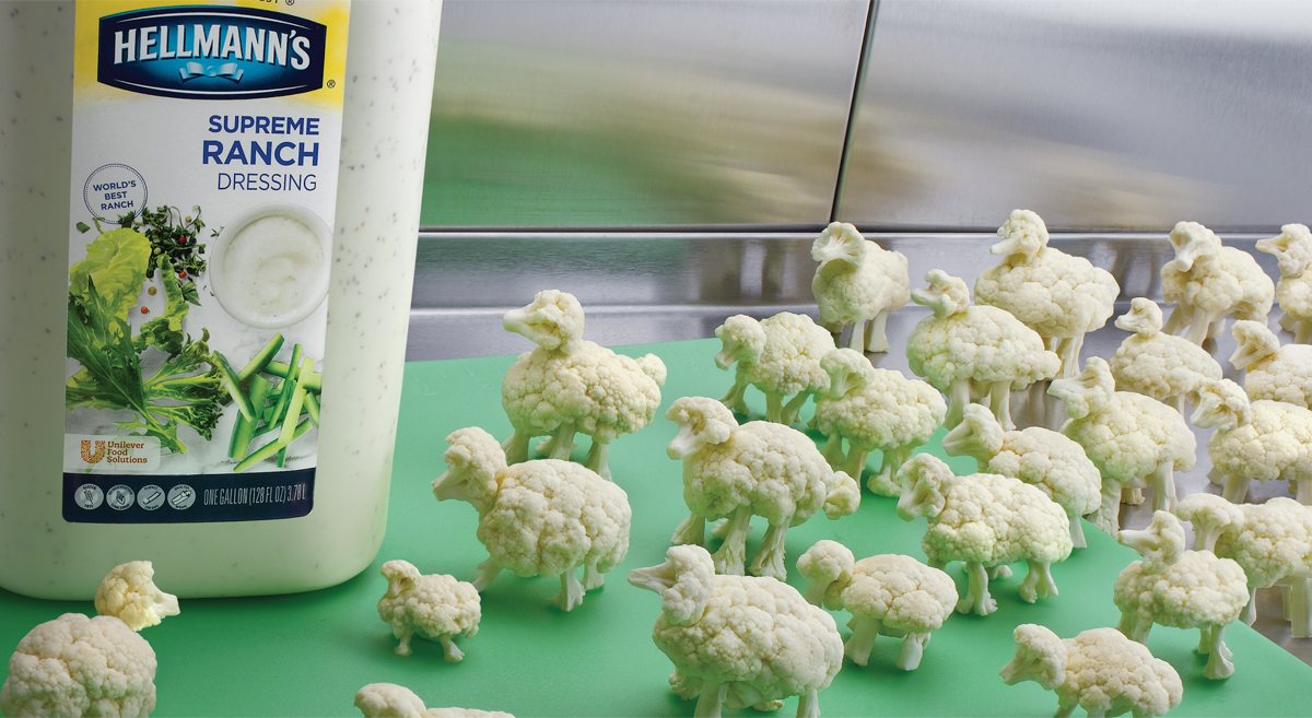
The final logo design uses the subtle shape of a Masonic plumb bob to create an iconic V-shape that draws emphasis to the hotel's name and location. We're in the process of developing more creative as renovation on the building continues to move forward. Please check back for updates and new work.

Vandivort Sketch

Share on...

Flavor Food Loves

Pedestrian salad dressings are something usually plopped on top of food. Great salad dressings will draw food and customers in. We developed both US and Canadian foodservice campaigns to introduce the delicious core line of Hellmann’s Dressings for Unilever Food Solutions.

UNI_Wings

UNI_Sheep

Share on...

Too School for Cool

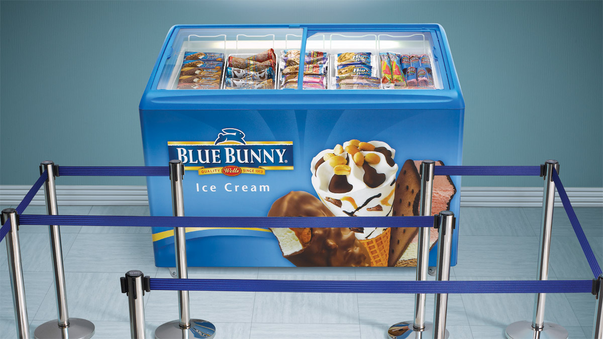
Blue Bunny novelties are loved by students of all ages. These ads specifically target the C&U and K-12 foodservice segments. We wanted them to showcase ice cream’s natural appeal and popularity in a uniquely Blue Bunny fun way.

BLUE-Bunker-Ad

BLUE-Max-Fisher-Ad

Share on...

Ice Cream Reaches New Heights

Blue Bunny Ice Cream is way more than vanilla, and we wanted to conceptually demonstrate it. We happily created this ice cream superiority campaign for both foodservice scoopable and novelties.

Blue_Turtle_Vortex_Ad

Peaks_Ad_Comp

Wings_Ad