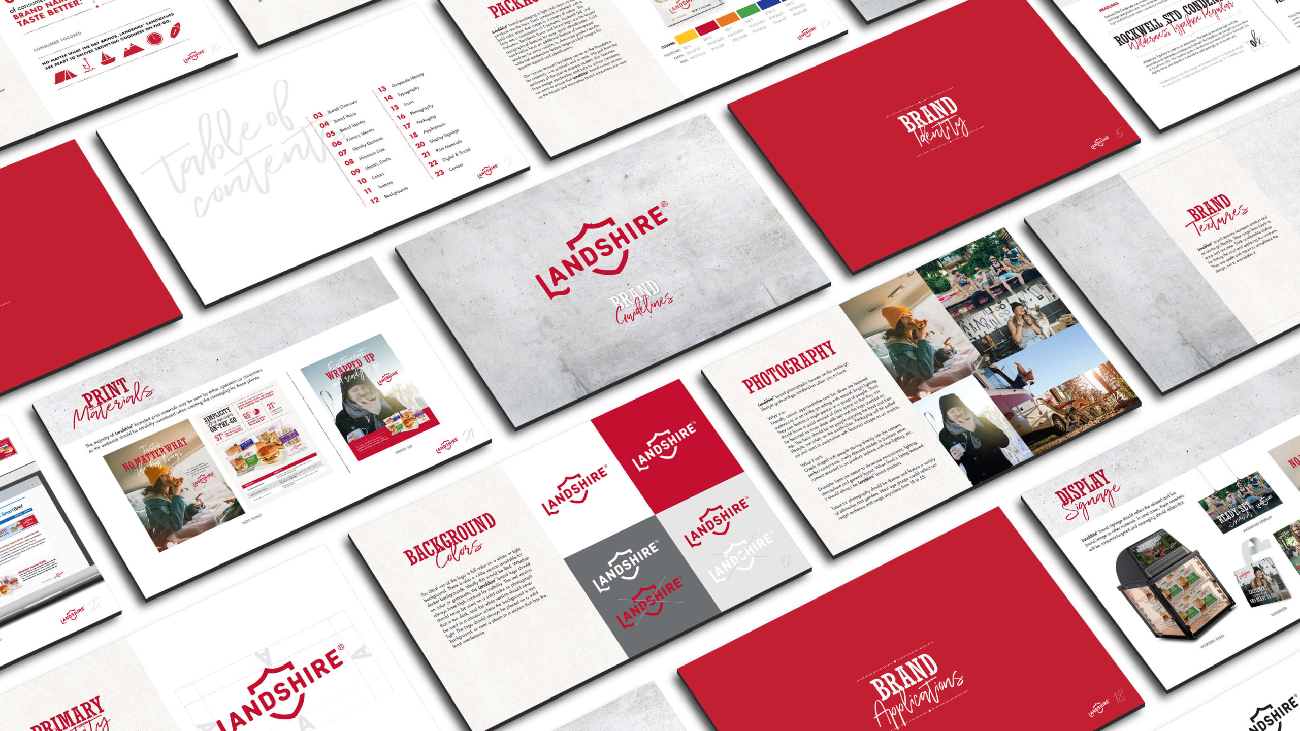
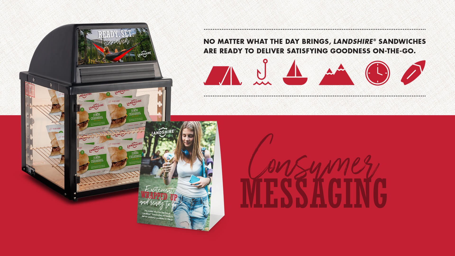
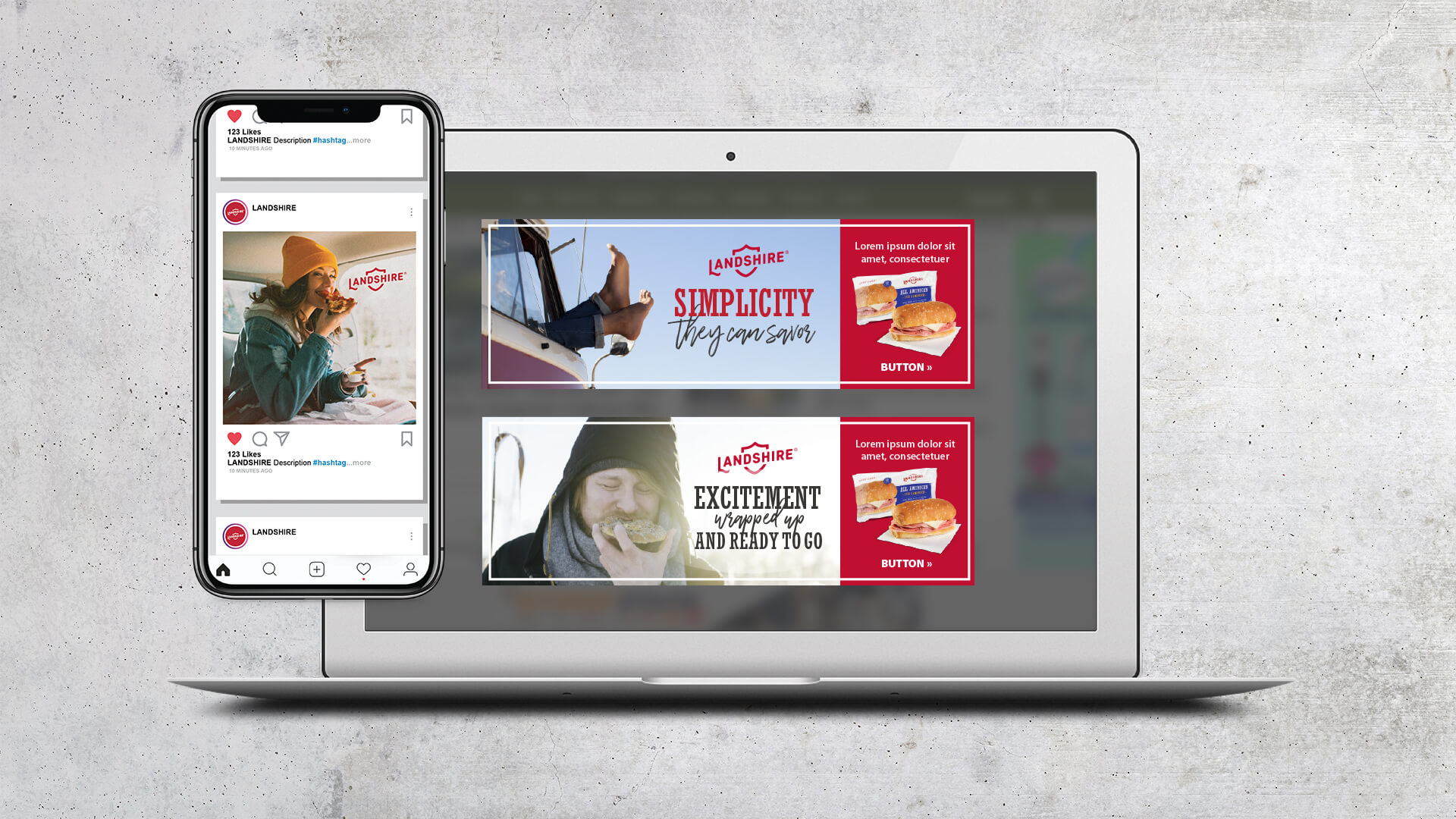
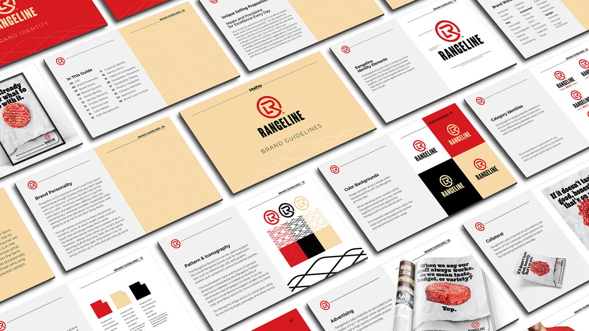
The good folks at Landshire recently asked if we would create brand guidelines to help flesh out the look and feel of the brand that would work in combination with the new logo and packaging designs they had previously developed. Spoiler alert: We said yes.
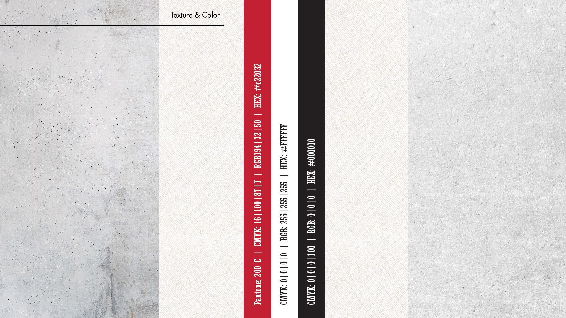
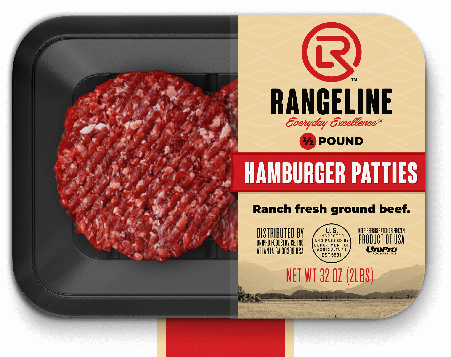
The developed designs worked with cloth texture, a colorful palette and a clean design. We wanted to complement that, so we took the look and feel and brought it down to a simplified 3-color scheme with some subtle, yet comforting, textures.
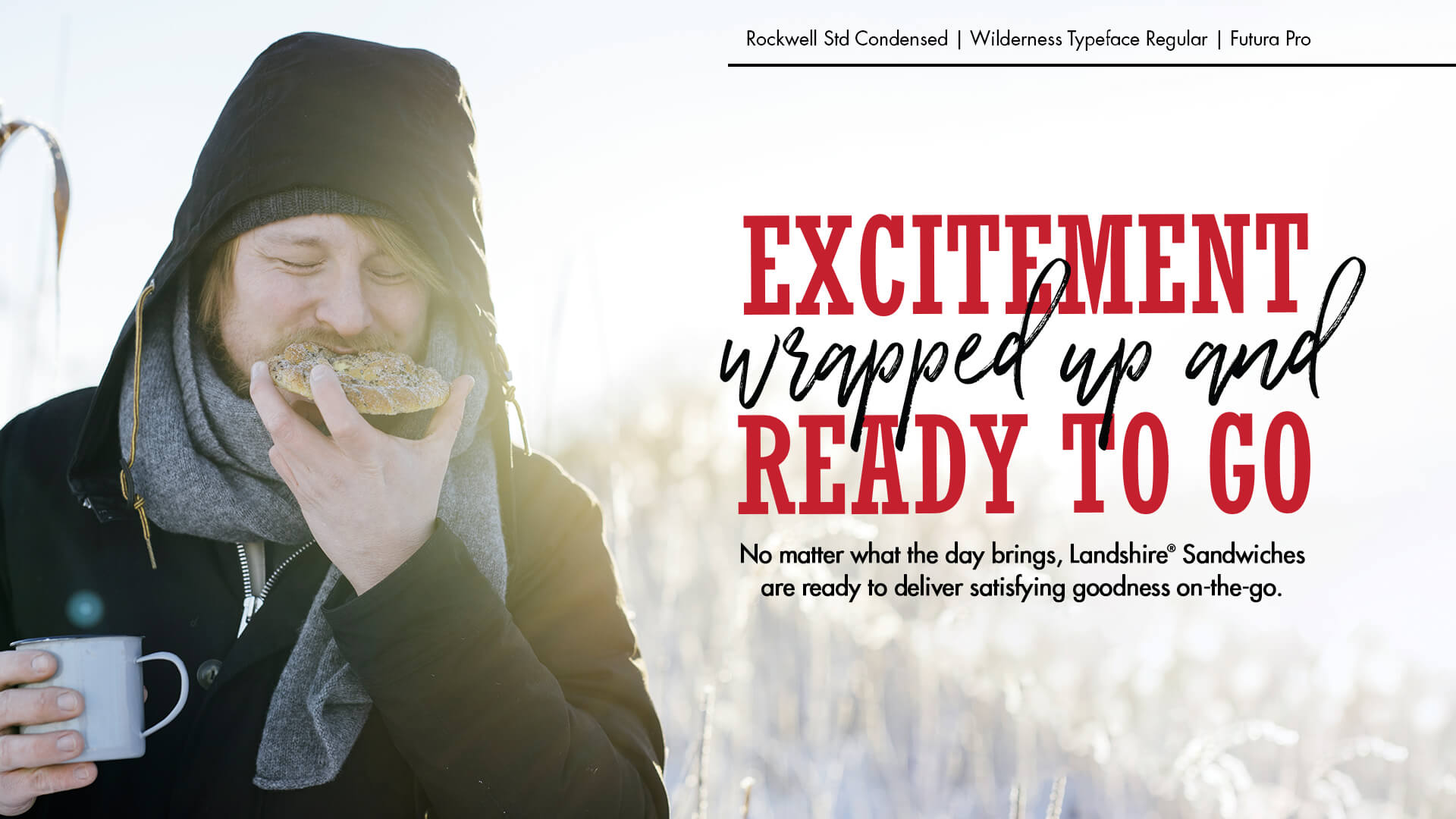
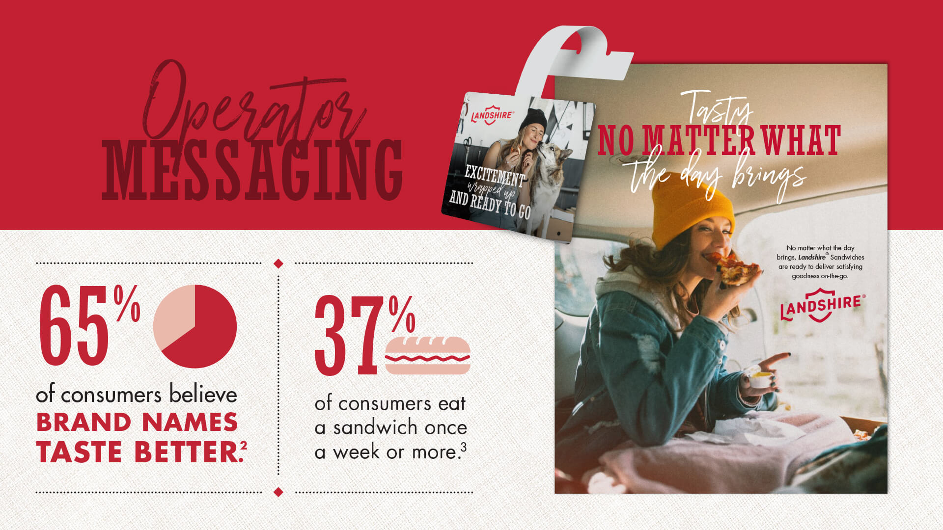
For the photography direction we wanted to focus on the on-the-go lifestyle that grab-and-go sandwiches allow you to have in more realistic, non-staged settings. To better capture this direction, we decided to showcase people enjoying the food and how it could complement their lifestyle. Going to the lake? Grab a few sandwiches. Late for work? Sandwich it up. Can’t figure out your kid’s math homework? Well, okay, a sandwich wouldn’t help much there, but it would still be really tasty. This direction helps highlight the benefits of the product instead of trying to make a simple sandwich something that it’s not. It’s delicious, easy, and saves you time. It’s not artisanal cuisine with over-the-top, fancy ingredients.
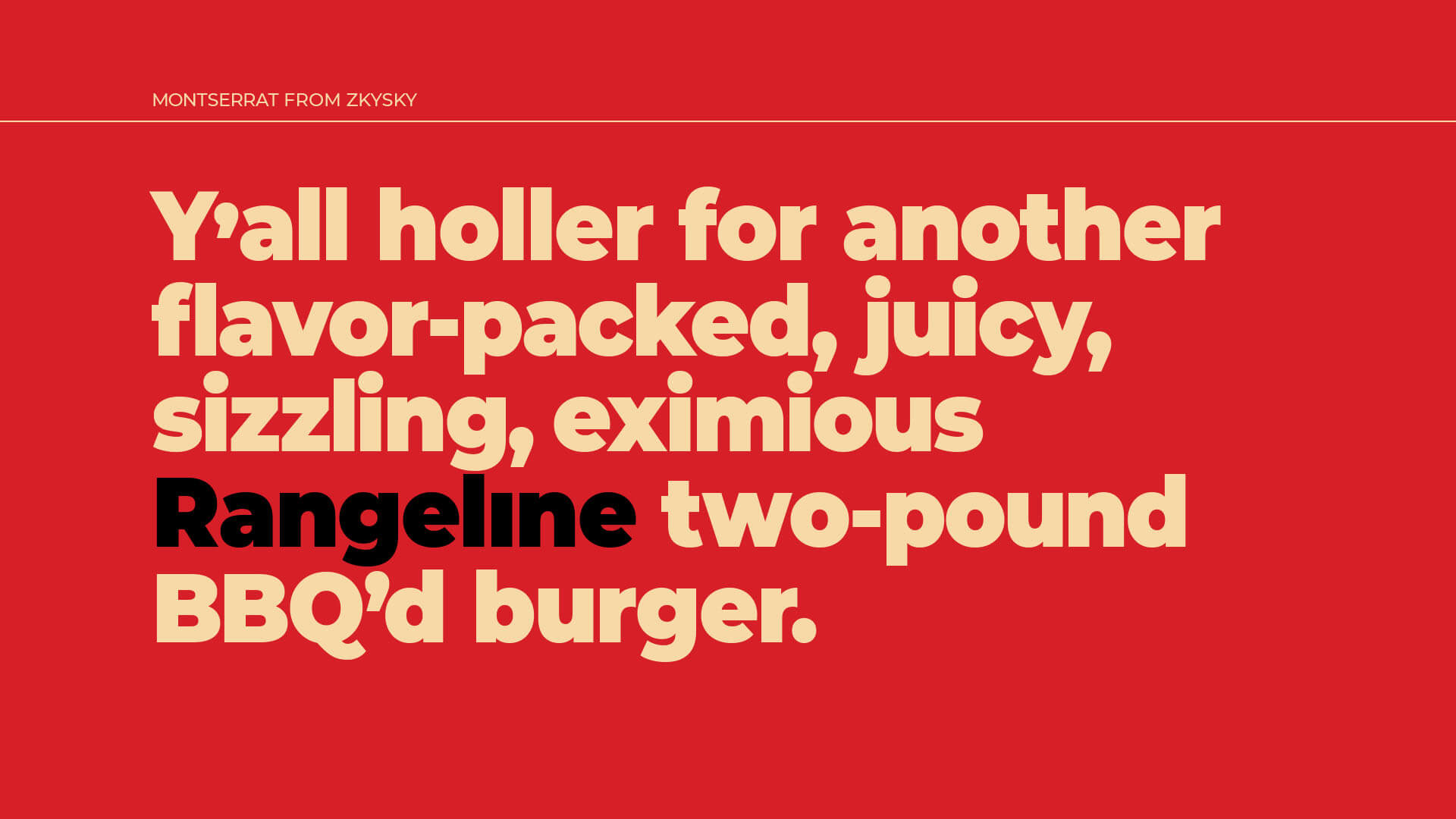
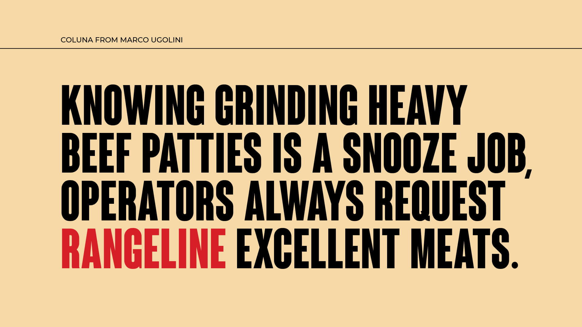
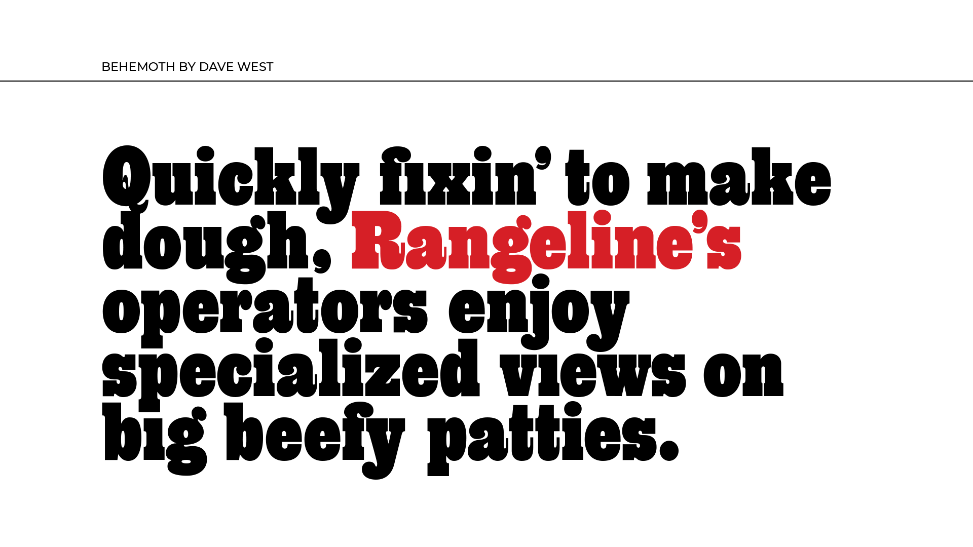
The fonts we used are a combination of the clean slab-serif packaging display font with a complementary, slightly messy script. The contrast of the two gives it an impactful, personalized feel and further emphasizes the sandwich itself and the on-the-go lifestyle.
The Landshire® brand is fun, down-to-earth and provides on-the-go solutions that anyone can appreciate. We couldn’t be happier to be able to bring that tone to these brand guidelines.
