Share on...
Beans love working for you best. White text on a red graphic background.

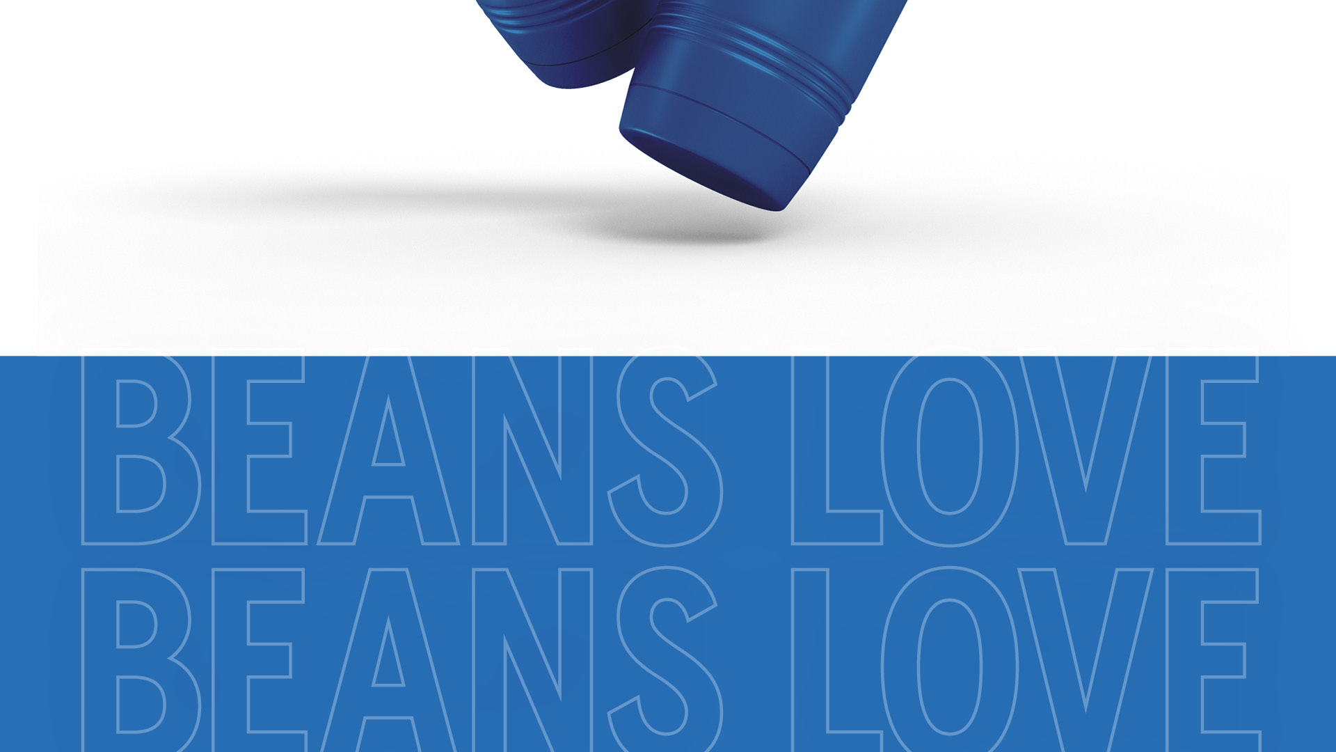
Beans Love a Good Refresh

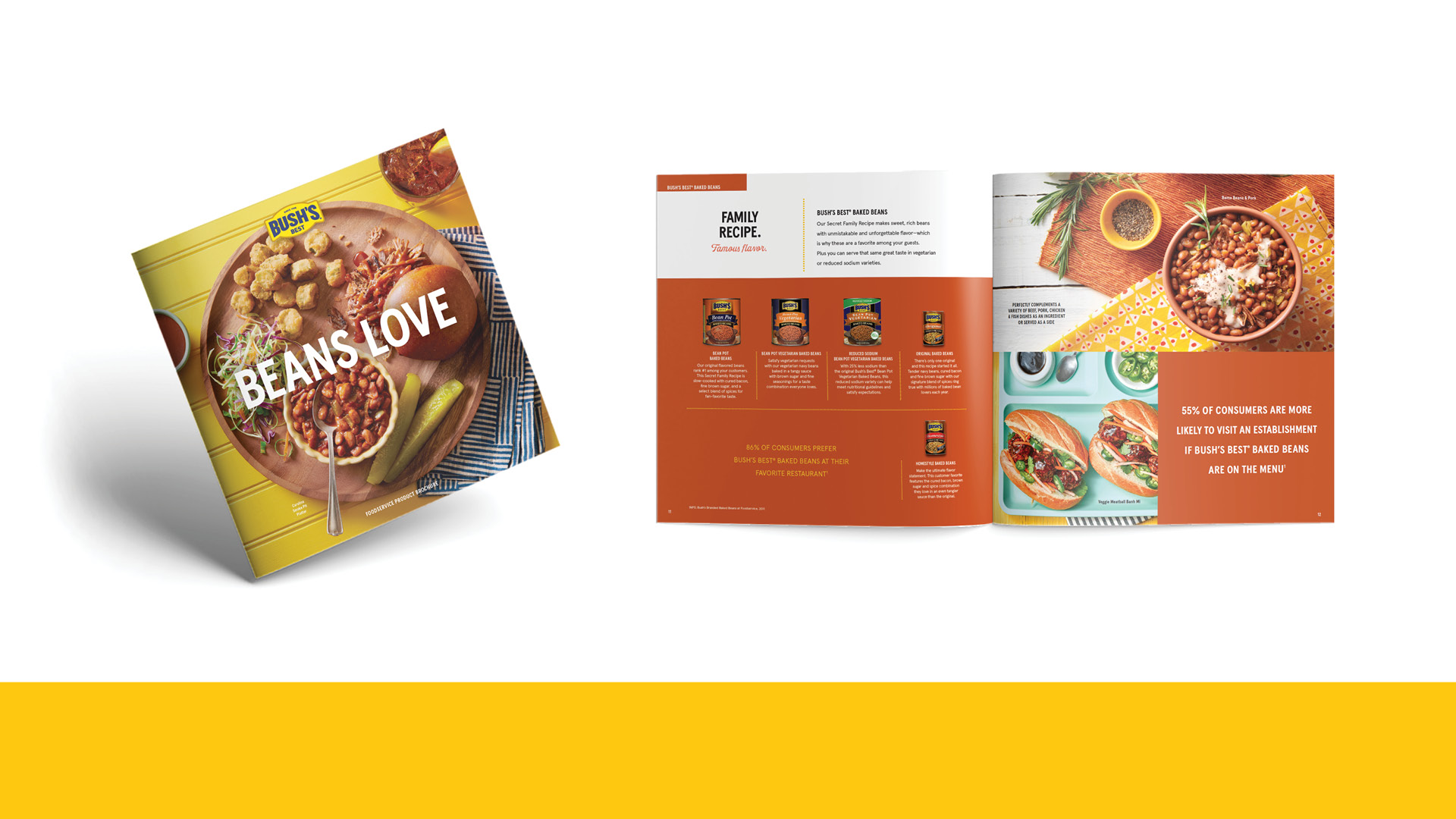
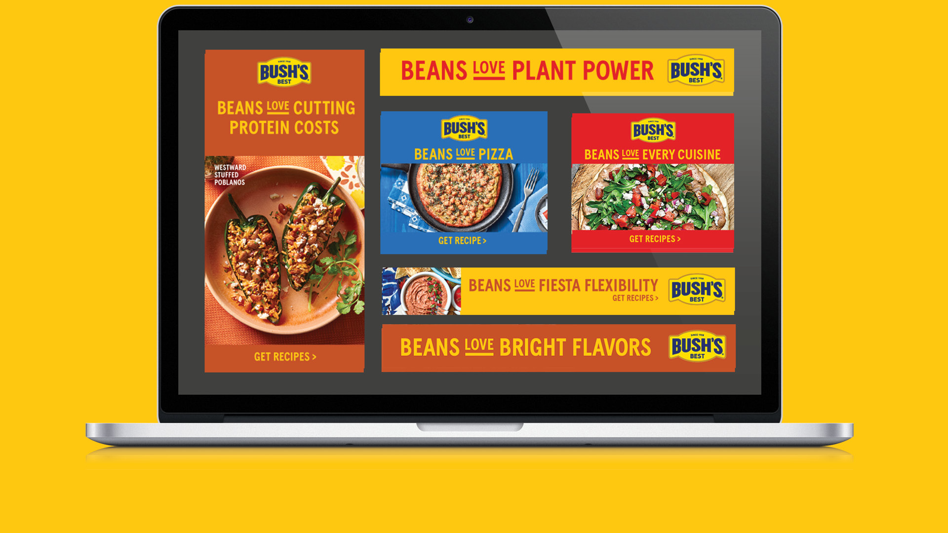
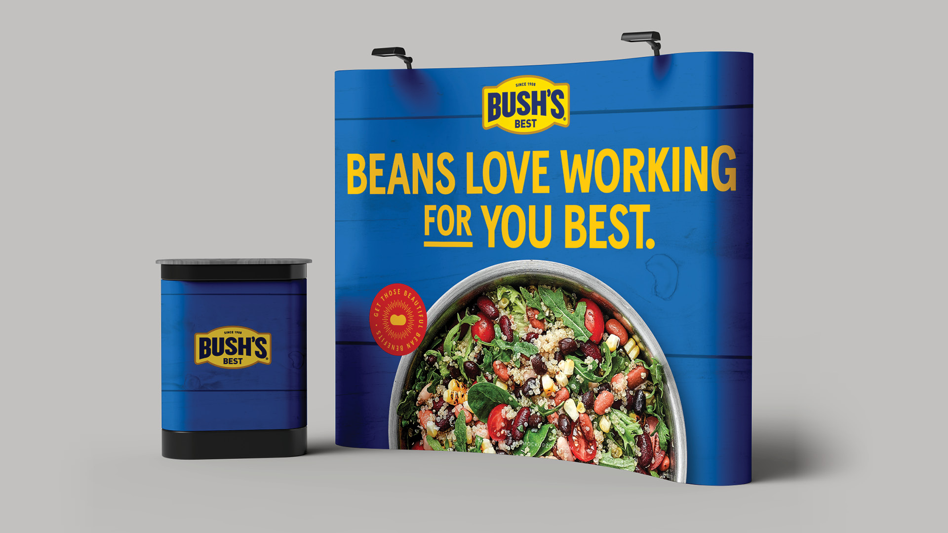
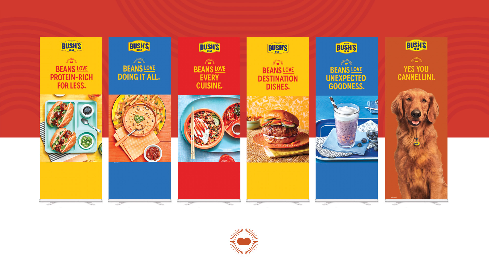
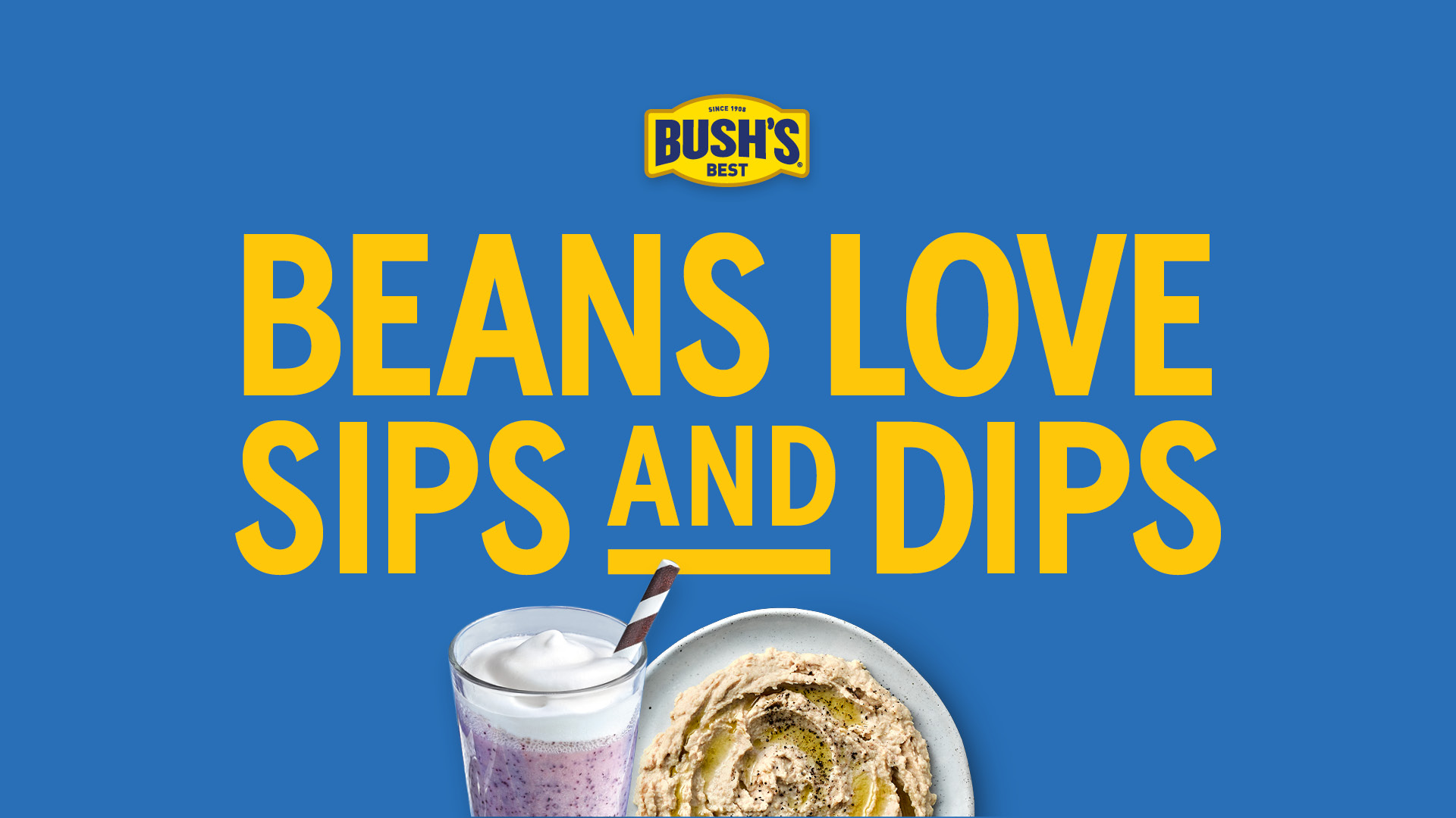
Bush’s Beans have always been doers, adding nutrition and protein with ease and yum factor. While that will never change, evolving the Beans Do campaign to reflect the brighter palettes and playfulness of the new retail campaign was in order. Keeping the functional spirit of “Beans Do [fill in the blank]” along with the desire to nurture and inspire foodservice operators, “Beans Love” allows Bush’s Best to communicate its platforms of support with feelings of warmth synonymous with the brand.

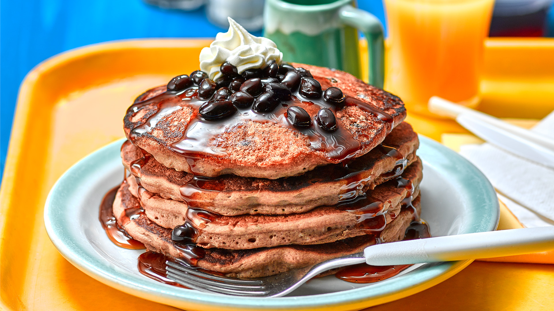
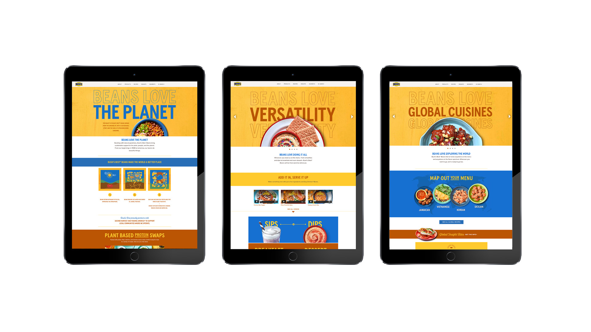
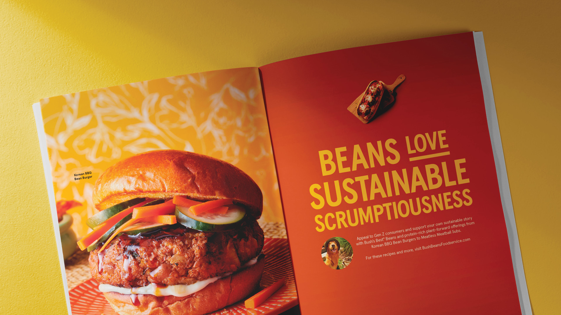
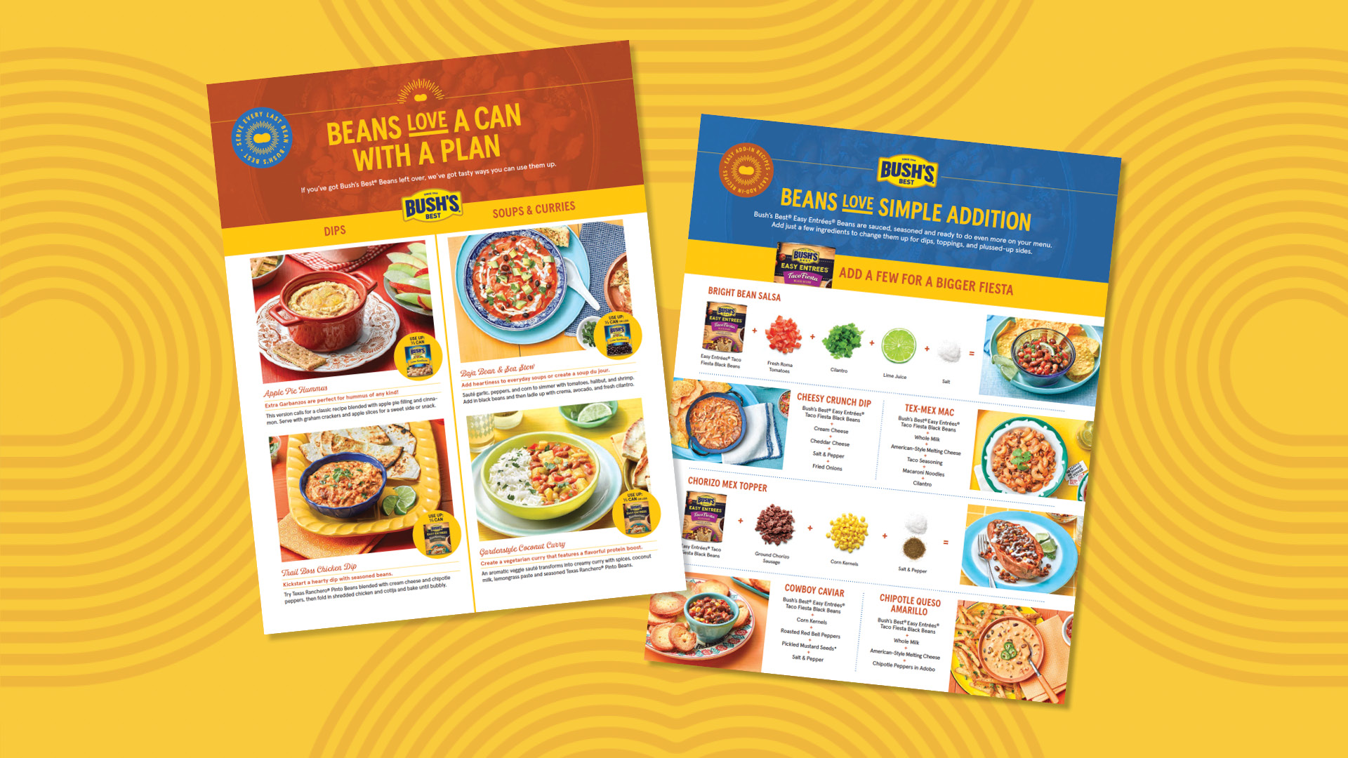
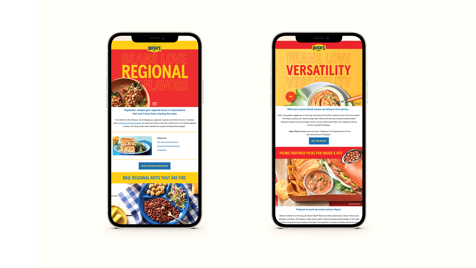
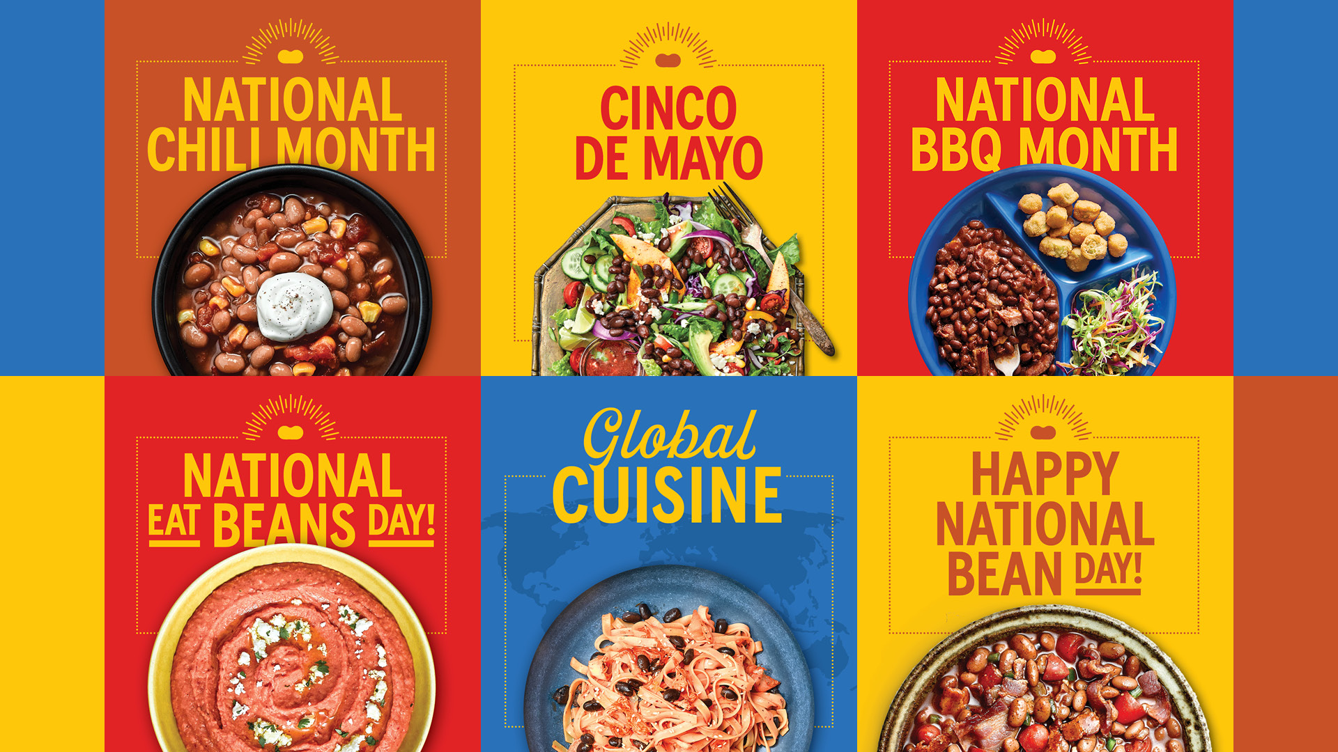
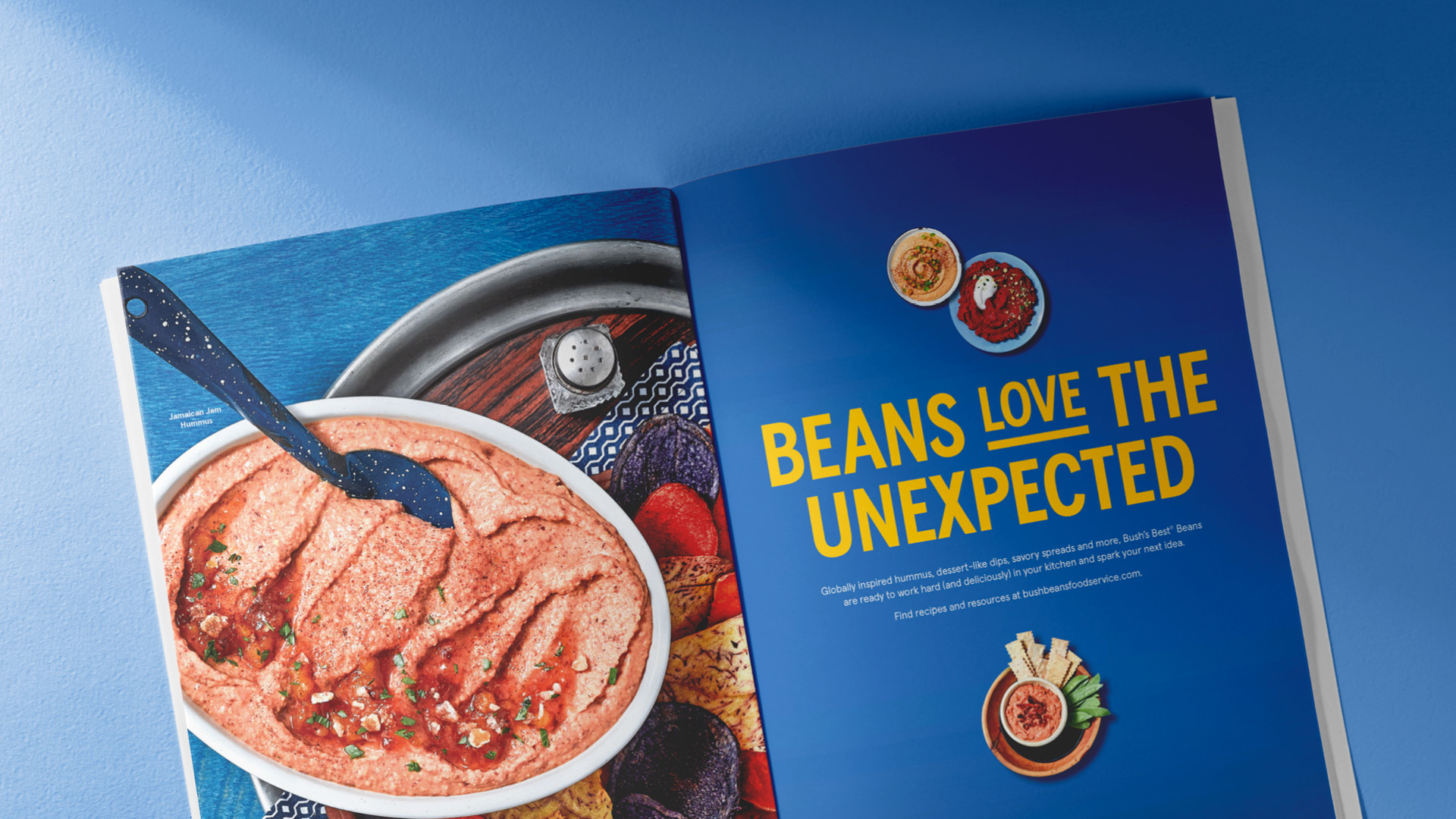
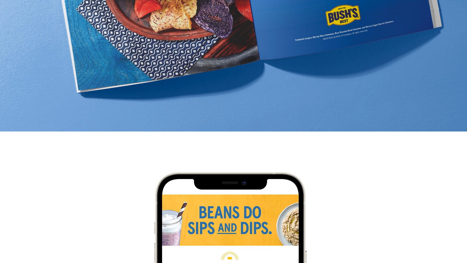
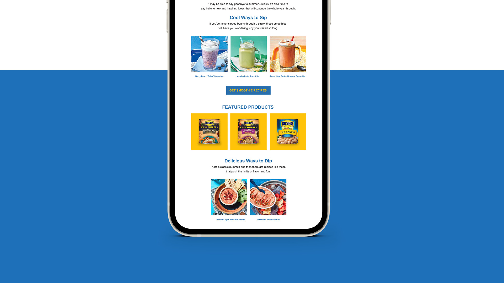
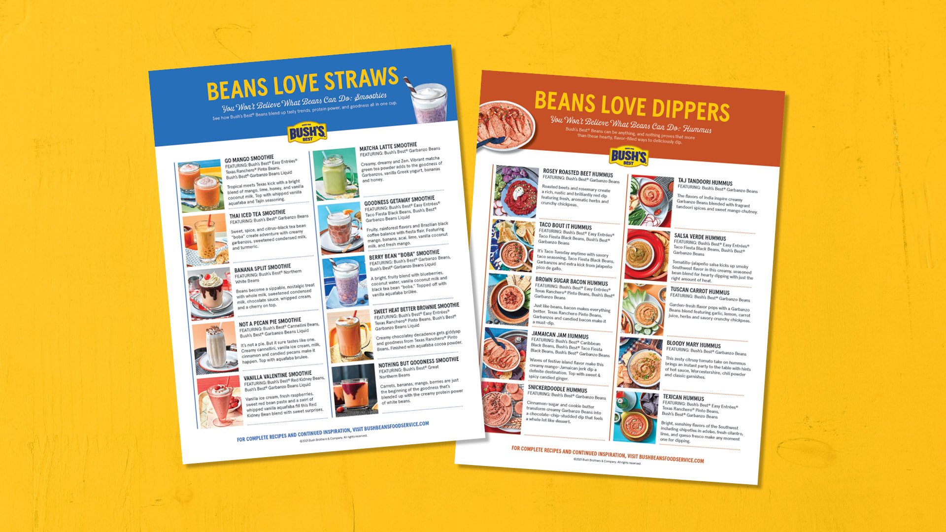
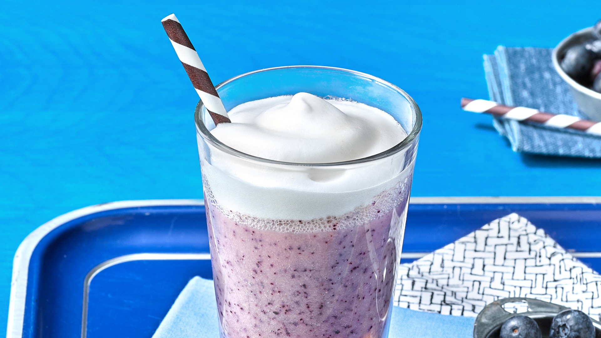
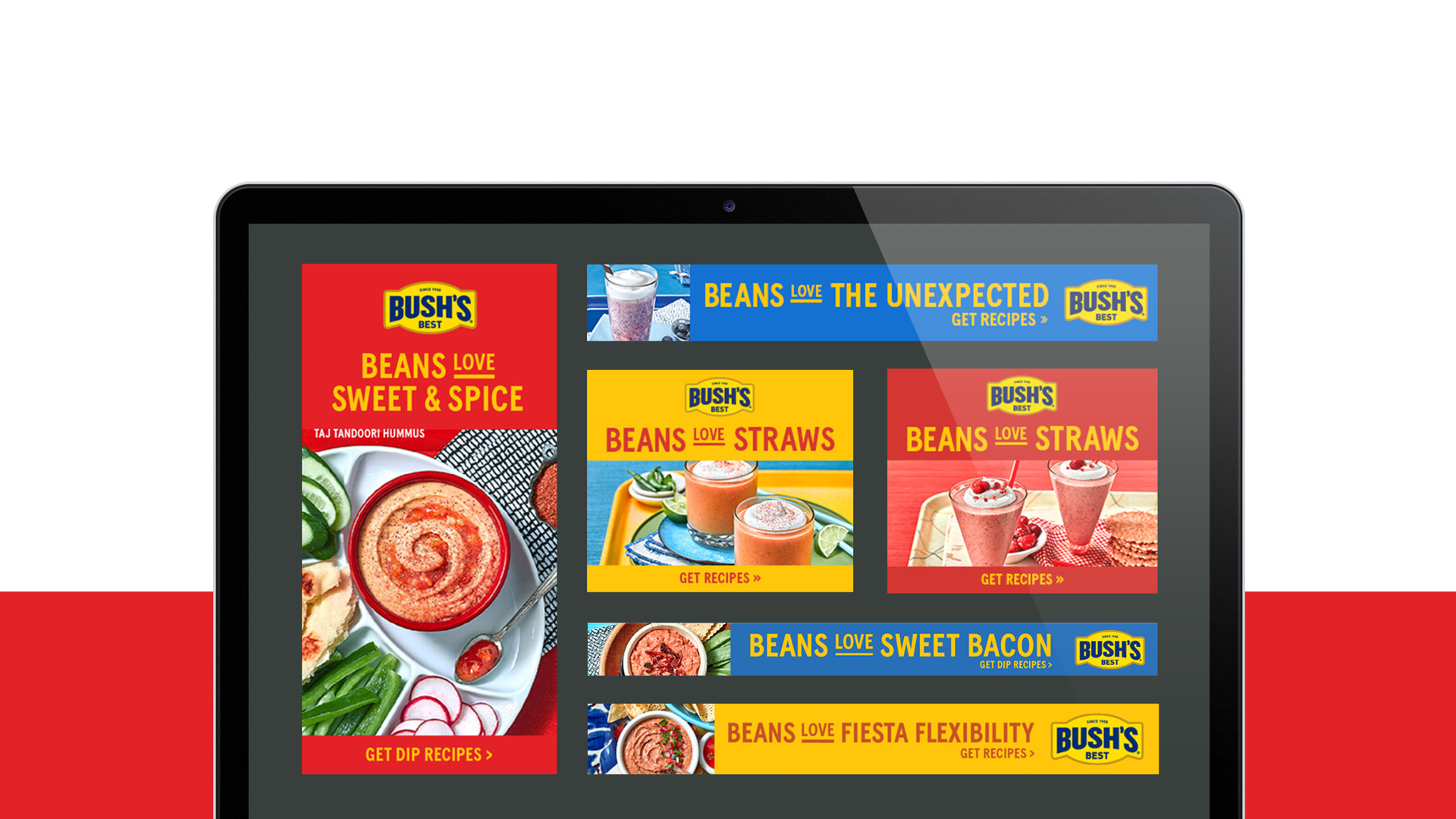
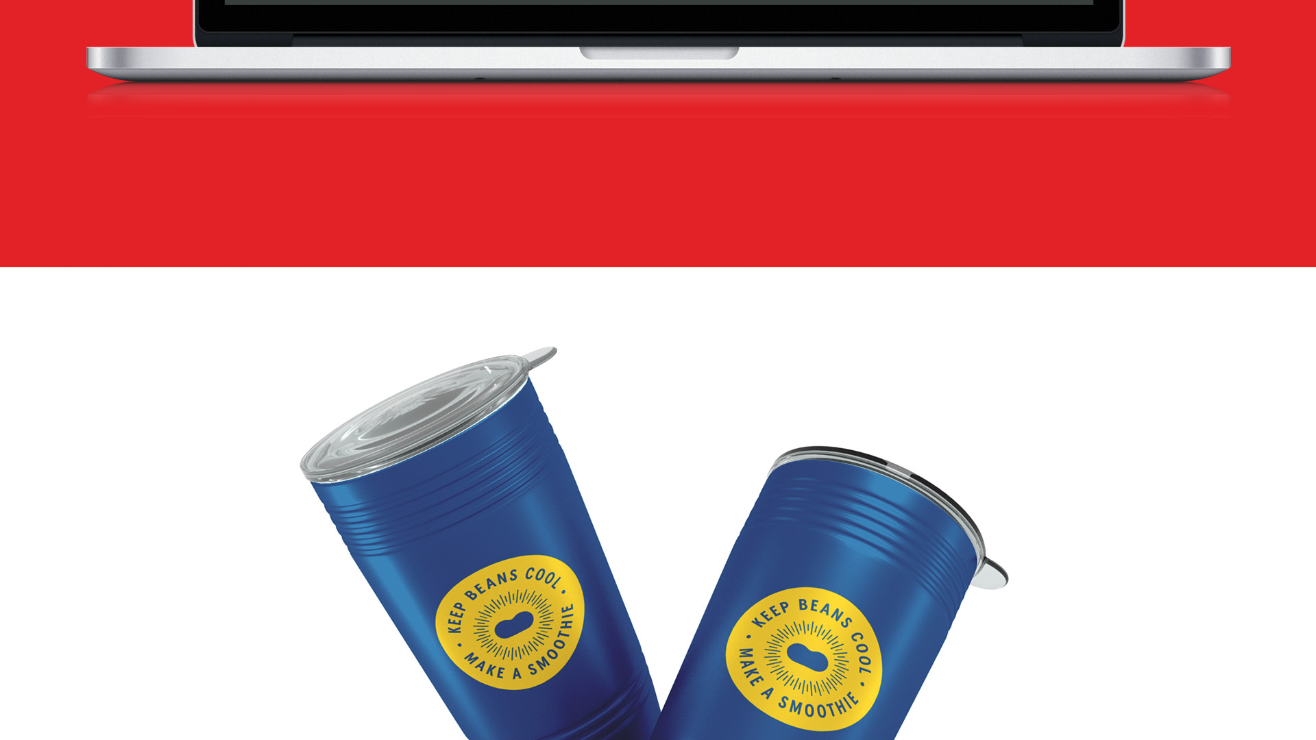
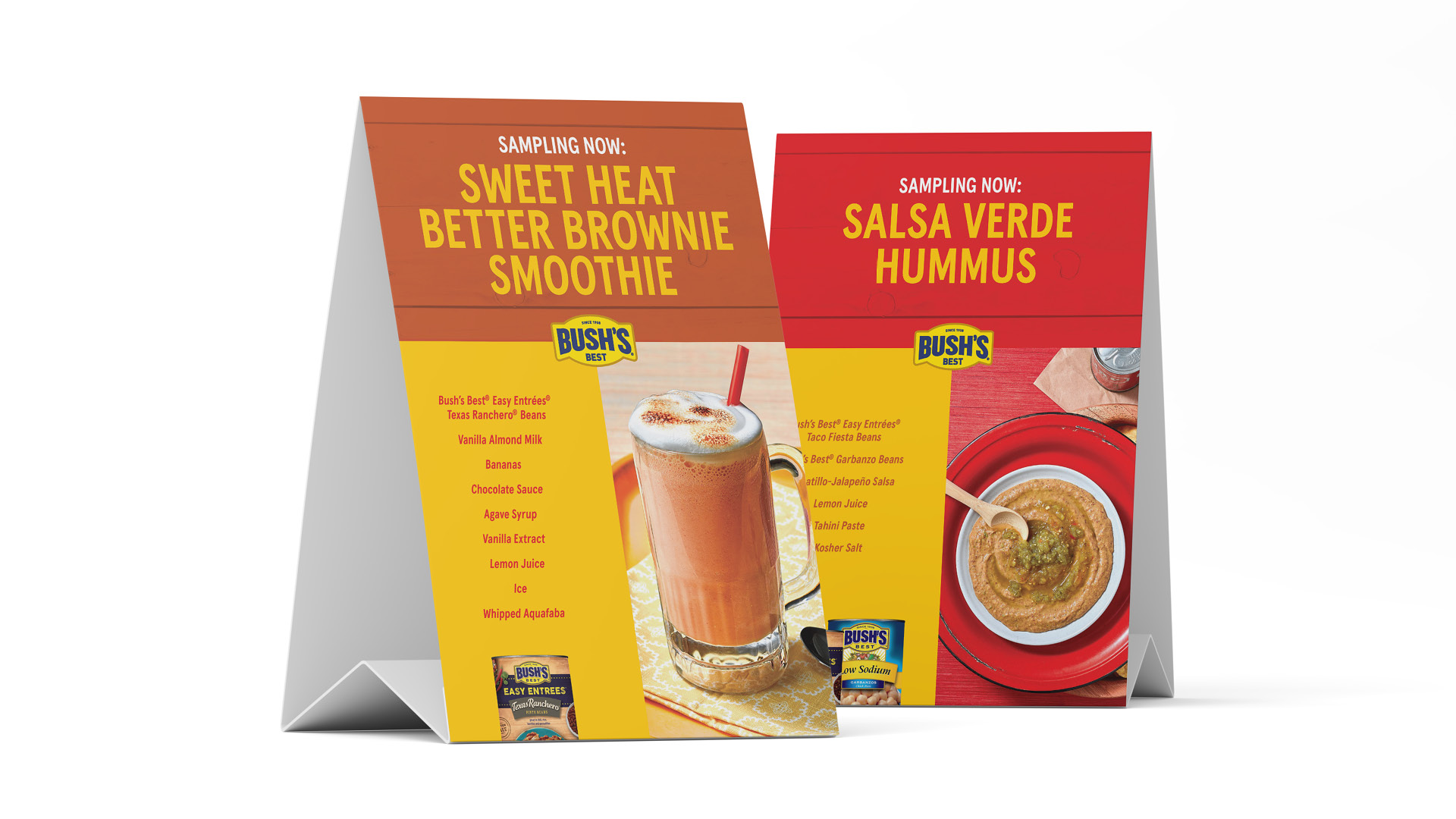
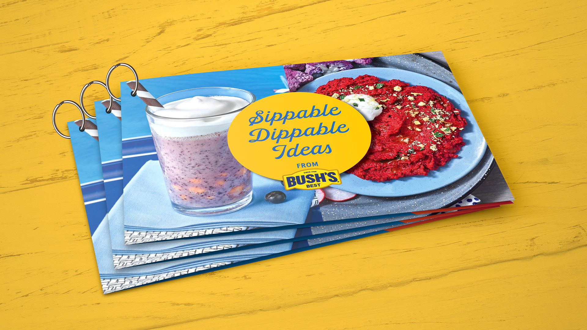
The approach to photography called for brighter pops of color with the propping, while making sure that the food still stood out the most. Sustainability and plant-based opportunities, the versatility of beans, and global inspiration drove new recipe development and photography as well as operator-focused tools including landing pages, tasty-style videos, and quick-tip build sheets. The global landing page also features resources specifically tailored to Colleges & Universities with promo calendar ideas and social media assets.

The Beans Love campaign exceeded expected click-through rates in digital media placements and garnered a large number of impressions. Brand unification across retail and foodservice channels (including updates on multiple existing assets) has invited operators into the warmth and supportive approach of the Bush’s brand that keeps their operational needs in mind.

Beans love pancake photography.Beans love digital examples on three tablet screens.Beans love magazine ad example on a yellow background.Beans love graphic type treatment in yellow on an orange background.Beans love sell sheets on a yellow graphic background.Beans love digital examples on smart phone screens with a white background.Beans love social ads on a multi-colored background.Beans love recipe guide on a white background.Beans love digital ads on a laptop screen with a yellow background.Blue Beans love tradeshow booth components.Beans love tradeshow banners on a red background.

Share on...
Tyson foodservice logo and tex that reads, "prep squad" on a blue background.

Your Own Personal Prep Squad

Tyson Foodservice understands what restaurant operators are up against today. Ongoing labor challenges. Heightened food safety concerns. And the prevailing need to “do more with less.” So they wanted to reach operators with a message that emphasized, “we’re ready to help.”

Marlin was ready to help, too. As we looked at Tyson Foodservice’s portfolio of ready-to-serve product solutions, we had a thought: it’s almost like the operator has a personal prep squad right there in the kitchen. And with that, help was indeed found. Our “Prep Squad” campaign was born.

Tyson foodservice prep squad help wanted poster.Tyson foodservice prep squad photograph of multiple plated recipes and Chef Kline.Tyson prep squad text with large knife, and brochure pages with cover.Multi page display of Tyson Foodservice prep squad examples.Tyson Foodservice prep squad stats on a photographic background with sliced chicken and a large knife.

#
Share on...
Blue background with yellow text that says "Beans love sips and dips." An image of a smoothie and a dip.

You Won’t Believe What Beans Can Do

Everyone knows Bush’s Best® Beans can complete a plate, but operators may not think about all of the surprising things beans can build—especially when it comes to snacks. With creative recipes that give operators new ways to use the beans they already buy, and further explore the snacking occasion, we whipped up the Sips and Dips campaign.

Seeing is believing (and in this case, mouthwatering), so we kicked it off with recipe development and a photoshoot featuring 20 smoothie and hummus recipes. To drive operators to the website and build excitement around beans, the recipes were featured on bushbeansfoodservice.com, in digital media, and became part of a trend-focused Flavor & The Menu article that was accompanied by a spread ad. Targeted emails and a recipe overview sheet helped communicate the flavor-trend opportunities with these simple, unexpected blends including the Sweet Heat Better Brownie Smoothie and Brown Sugar Bacon Hummus.

What did operators think about putting beans in smoothies? At Flavor Experience 2021, the Bush’s Best® team handed out Sips and Dips recipe booklets, insulated smoothie travel cups, and got rave reviews on all the samples, most especially the Sweet Heat Better Brownie Smoothie. And The Berry Boba Smoothie looked so darn good that the Bush’s retail agency asked to feature it on their social media feed. Admit it. You want to see what it’s like to sip on beans. Our advice? Grab a straw for a delicious bean smoothie (and some chips to go with all those dips).

An open brochure on a blue background with dip photography and text that says "Beans love the unexpected."The bottom portion of a brochure, and the top portion of a cell phone screen that says "Beans do sips and dips."Sips and Dips web page featured on a smart phone screen.Two recipe inspiration pages that feature drinks and dips.Purple Bean Smoothie featured on a blue tray with a blue background.Several digital ads on a laptop screen.Two blue insulated mugs with lids that say "Keep Beans Cool. Make a Smoothie."Stylized typography that says "Beans Love."Two table tents that feature Sweet Head Better Brownie Smoothie, and Salsa Verde Hummus.Bush's Sips and Dips recipe guide. Three printed ringed booklets that say "Sippable Dippable Ideas."

Share on...
The Pub® burger image on a table. Your next mouthwatering masterpiece is waiting to be made. Beef Rebrand.

An Eye-catching, Mouthwatering Beef Rebrand

There’s nothing we love more than really sinking our teeth into a rebranding. Especially when that rebranding happens to include a product we can literally sink our teeth into. Such was the case with our recent work with the Tyson Foodservice brand The Pub®. Because it’s so well known for providing operators with a delicious, premium product that they can build on, we dedicated ourselves to creating a logo and beef rebrand materials that would do that heritage justice.

Speaking of the logo, when we started work on revitalizing The Pub®, we wanted to modernize the logo while maintaining the sense of history and reliability that is so integral to the brand character. We reduced some of the older unnecessary elements and added a tagline to help the brand maintain its essence across all uses and materials. The updated photography captures the feel of a pub’s atmosphere and the brand colors were subtly worked into each setting as well.  We chose a new font pairing to give the brand a more contemporary feel that, much like a quality rug, really ties everything together. The expressive brush font was chosen to enhance the artistic “masterpiece” theme, and the sturdier san serif font helps ground everything.

In the end, we couldn’t be happier with how this mouthwatering beef rebrand turned out. We love the way all the different components came together with a fresh logo, eye-catching marketing materials, and some helpful brand guidelines to help place this wonderful brand and all of its products into a package that’s so vivid you can almost taste.

The Pub® Brand GuidelinesThe Pub® logo with white background, blue background, and yellow background examplesPoster with text that readys "We call it a masterpiece" and a burger imageThe bottom of a poster that reads "We can call it delicious"Digital ad examples. Displayed on the background as well as a laptop and cell phone.Food warmer and shelf dangler ad examples.Food warmer with display and shelf dangler. The top portion of a brochure.Thanks!