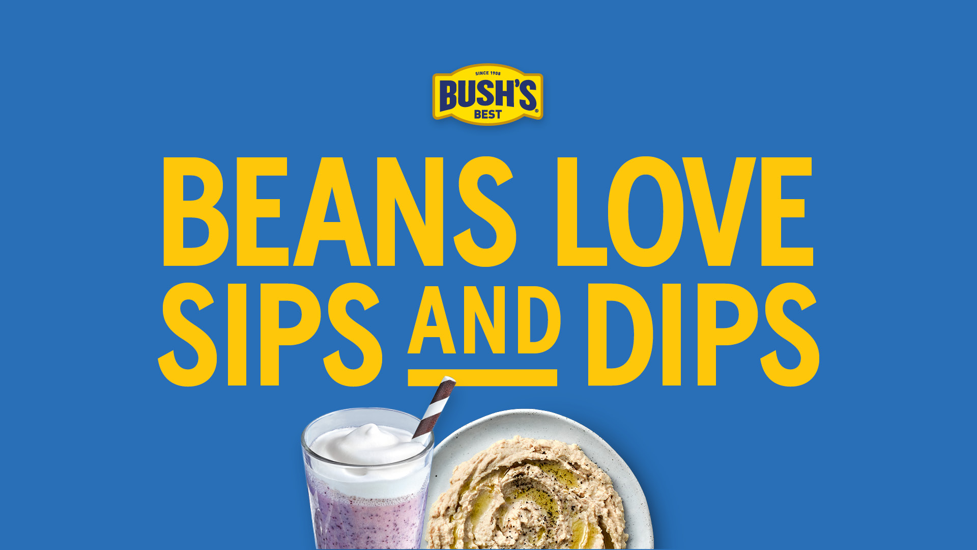
You Won’t Believe What Beans Can Do
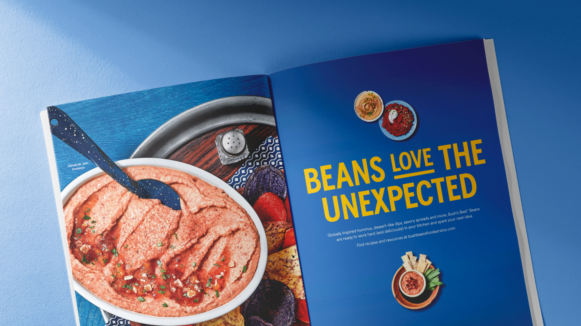
Everyone knows Bush’s Best® Beans can complete a plate, but operators may not think about all of the surprising things beans can build—especially when it comes to snacks. With creative recipes that give operators new ways to use the beans they already buy, and further explore the snacking occasion, we whipped up the Sips and Dips campaign.
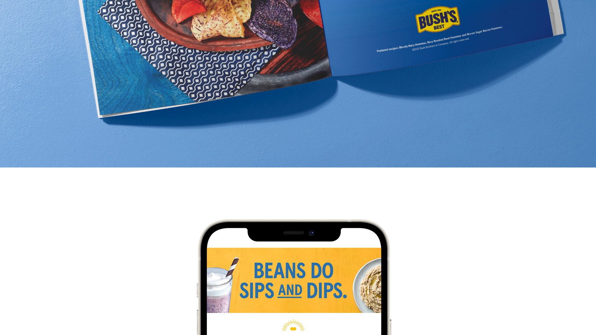
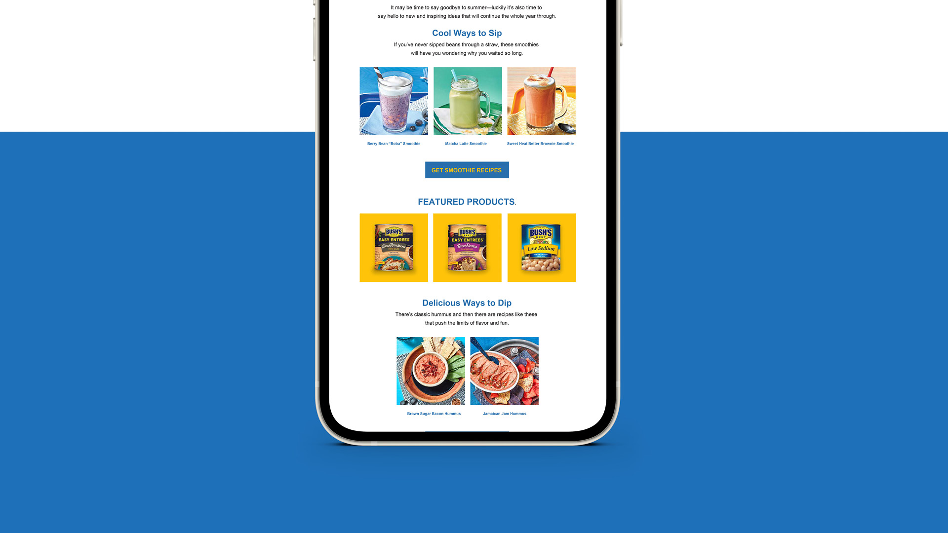
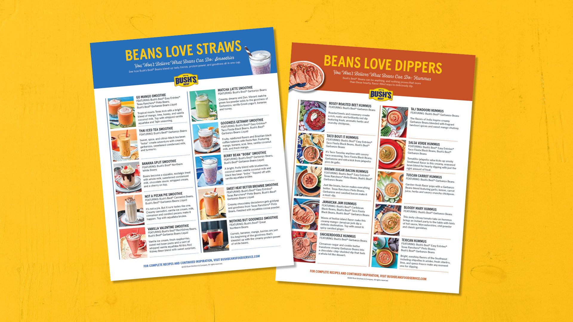
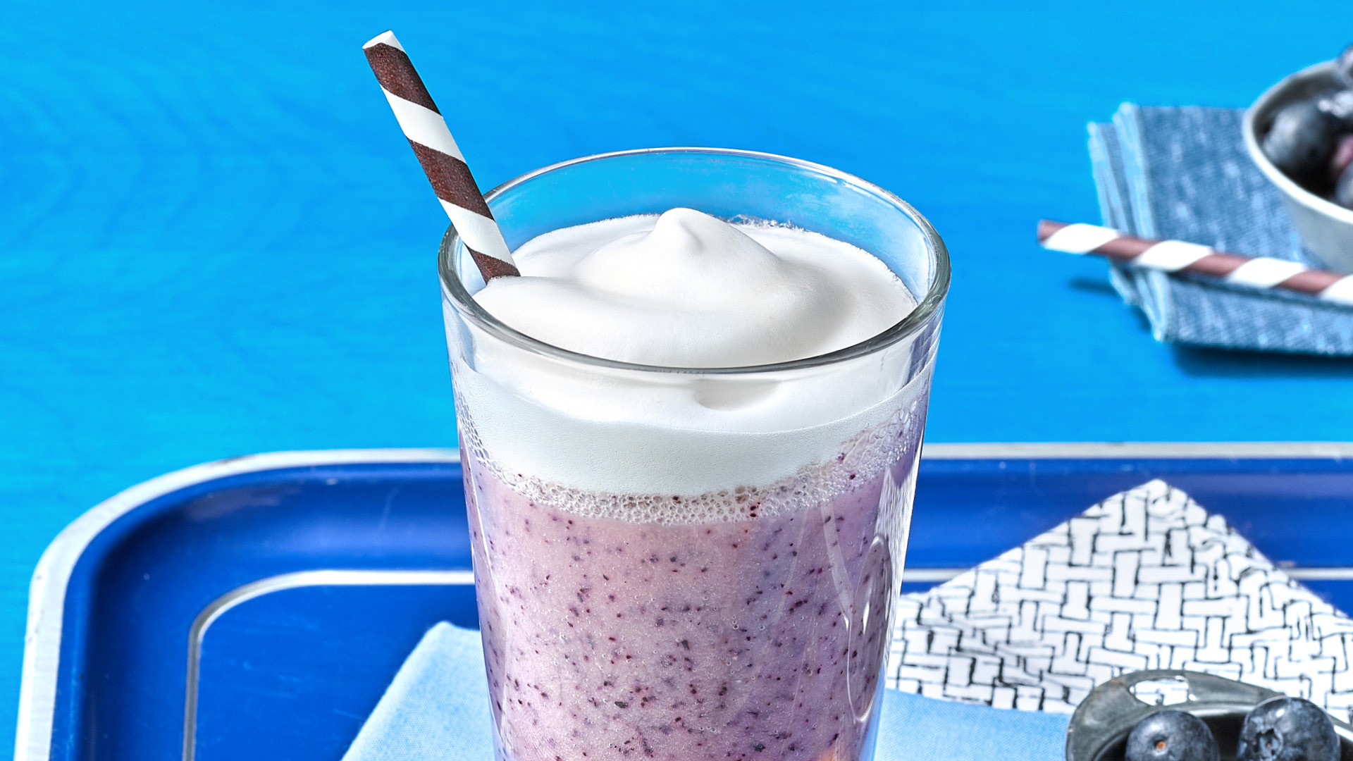
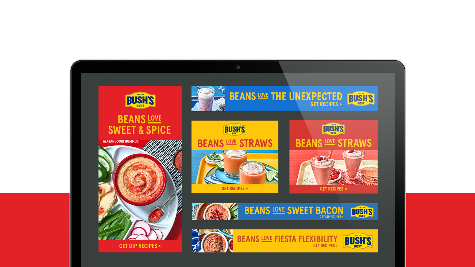
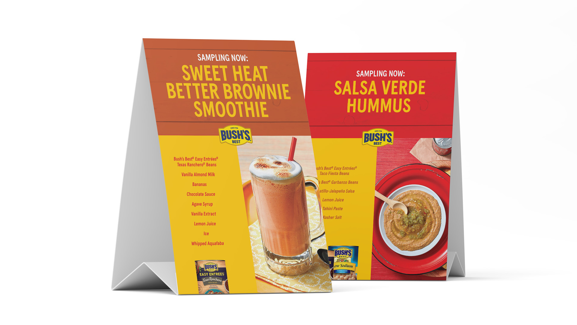
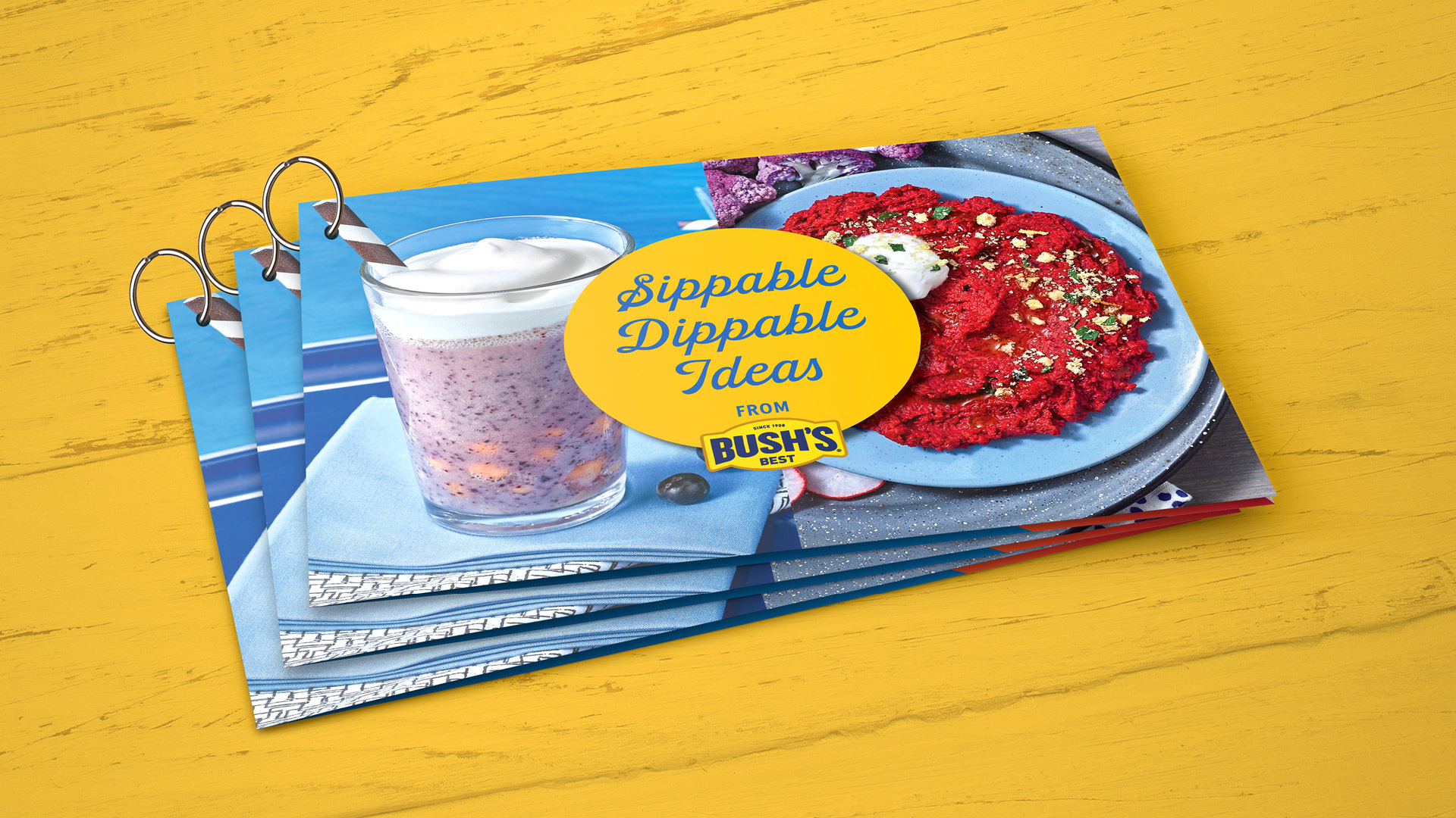
Seeing is believing (and in this case, mouthwatering), so we kicked it off with recipe development and a photoshoot featuring 20 smoothie and hummus recipes. To drive operators to the website and build excitement around beans, the recipes were featured on bushbeansfoodservice.com, in digital media, and became part of a trend-focused Flavor & The Menu article that was accompanied by a spread ad. Targeted emails and a recipe overview sheet helped communicate the flavor-trend opportunities with these simple, unexpected blends including the Sweet Heat Better Brownie Smoothie and Brown Sugar Bacon Hummus.
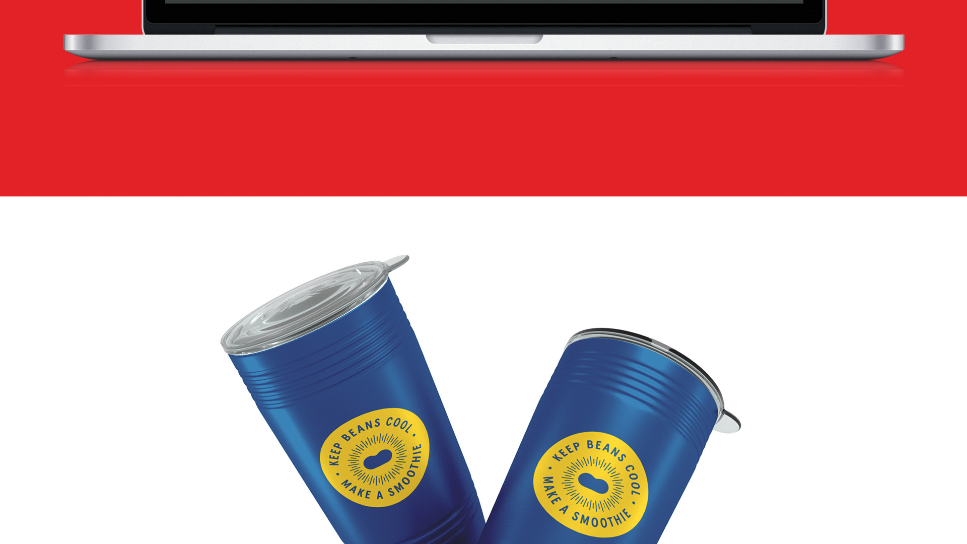
What did operators think about putting beans in smoothies? At Flavor Experience 2021, the Bush’s Best® team handed out Sips and Dips recipe booklets, insulated smoothie travel cups, and got rave reviews on all the samples, most especially the Sweet Heat Better Brownie Smoothie. And The Berry Boba Smoothie looked so darn good that the Bush’s retail agency asked to feature it on their social media feed. Admit it. You want to see what it’s like to sip on beans. Our advice? Grab a straw for a delicious bean smoothie (and some chips to go with all those dips).